|
Viewout
|
|


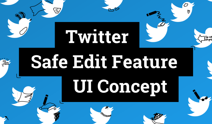
But what I’ve also seen a lot in this context, probably the second largest amount of comments, were tweets from people, who were more neutral towards the new character limit and instead pointed out how they would much rather like an edit functionality being introduced. Which, again, in several cases lead to replies from others explaining how this would be an even worse idea. Some of these conversations also were kinda constructive and came to results such as that a short time interval after sending a tweet to correct typos might be acceptable.
Coming from Google+ and seeing how editing also got through without constant and big hazards on Facebook, I really also don’t think it would be a big deal on Twitter also without time limits.
Nonetheless, I want to show with this concept an edit functionality that would even fulfill the demands of more cautious users, who believe that normal editing unlike on Google+ and Facebook would be more problematic on Twitter, while not restricting the feature in terms of time or how often tweets could be edited.

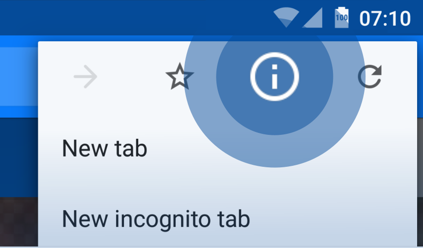
Thus I think it’s very possible that one might find oneself in a situation, where you’ve got a lot of relevant tabs open in incognito mode, which you don’t want to close yet, but you might also want to replicate the initial experience of a new incognito window and all it's advantages. That is where this concept’s feature would turn out useful.
As you can see in the concept image at the top, the idea is really straightforward: right click on an incognito window to access a new option to “Clear incognito cache”, which would clear all cookies and other data amassed during the current incognito session, but with all tabs staying open.
As you can see in the mock-up above, this concept imagines a new Site info-feature that would be built directly into Chrome’s overflow menu and solely focused on all kinds of site-wide features. So besides sharing, printing or bookmarking http://viewout.net/2016/03/10/concept/Google-Chrome-Android-Site-Info-Concept, this would be the place to overview and control everything related with the overall website viewout.net, like changing the permissions you once gave to it, having access to saved passwords and much much more.
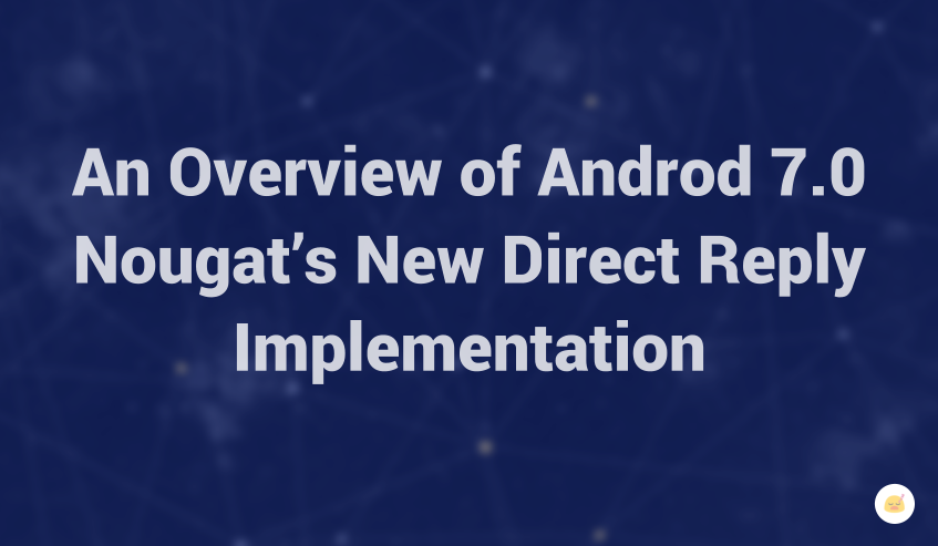
It’s little surprise then to see Android Nougat again focusing a lot on that aspect, introducing things such as a new look for notifications, grouped notifications, new & more highlighted control options and a new direct reply implementation for messaging apps.
At first, all these updates might not sound like much and kind like like not needed updates and catch-up features. Actually, however, I’ve found that they’re a lot more significant than their names and first appearance might suggest, perhaps even displaying the greatest advancement to Android’s notifications since 2011’s introduction of actions and resizing, as they appear to be just the beginning of a deeper rethought of the system’s notification system.
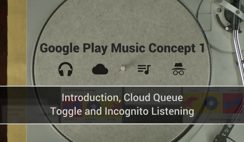
And until today - countless new iterations, a new name, several complete overhauls and the introduction of a new main feature with music subscriptions later -, this core concept and type of cloud integration is still what defines the service and sets it apart from the competition.
But though a cloud service at its very core, one thing that has not progressed, and which makes Google Play Music feel strangely unconnected today, is the still local-only listening experience. Instead of a unified, cloud-based implementation, every device still has it’s own local music queue and, even worse, own local music history and often thereof based suggestions, leading to many small, divided experiences in all the different places that a user is interacting with the service.
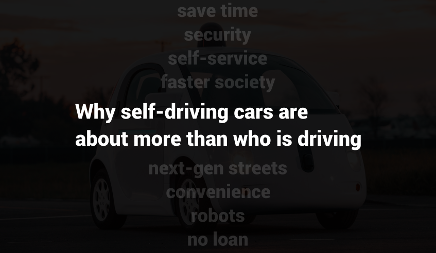
Thus, I’ve decided to create this list with some less obvious aspects that self-driving cars could fundamentally change, also beyond the usual stuff like that they are way more secure than we human drivers. Of course the majority of people certainly understands that it’s about more than just ‘who is driving’, but I think it’s interesting anyway for everyone to try and think on the one hand side more openly about this rising technology, as well as about a few more concrete ideas what changes might come with it, perhaps even touching science fiction to a certain degree.
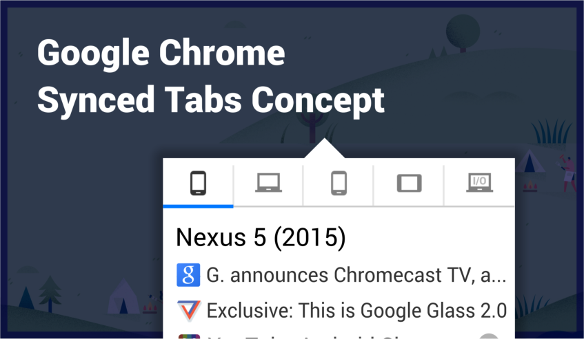
Today however, this big strength appears to be rather underutilized. On the desktop, Synced Tabs have been downgraded to being just a part of Chrome’s “recent tabs” menu, which also includes 2-3 recent links from other connected devices. Of course it can still be very useful that way, but in first place, Google is making Synced Tabs a niche feature, and this despite the ever increasing role of smartphones, mobility and cross-device browsing.
To take full use and fully accelerate the growing potential of this feature, this concept imagines how Synced Tabs could be implemented in a better way. Considering just how few Chrome’s UI has changed over all the years, the idea presented in this concept might actually display the biggest shift in user experience ever for Chrome, though I’m convinced that this would be the right step and pay off.
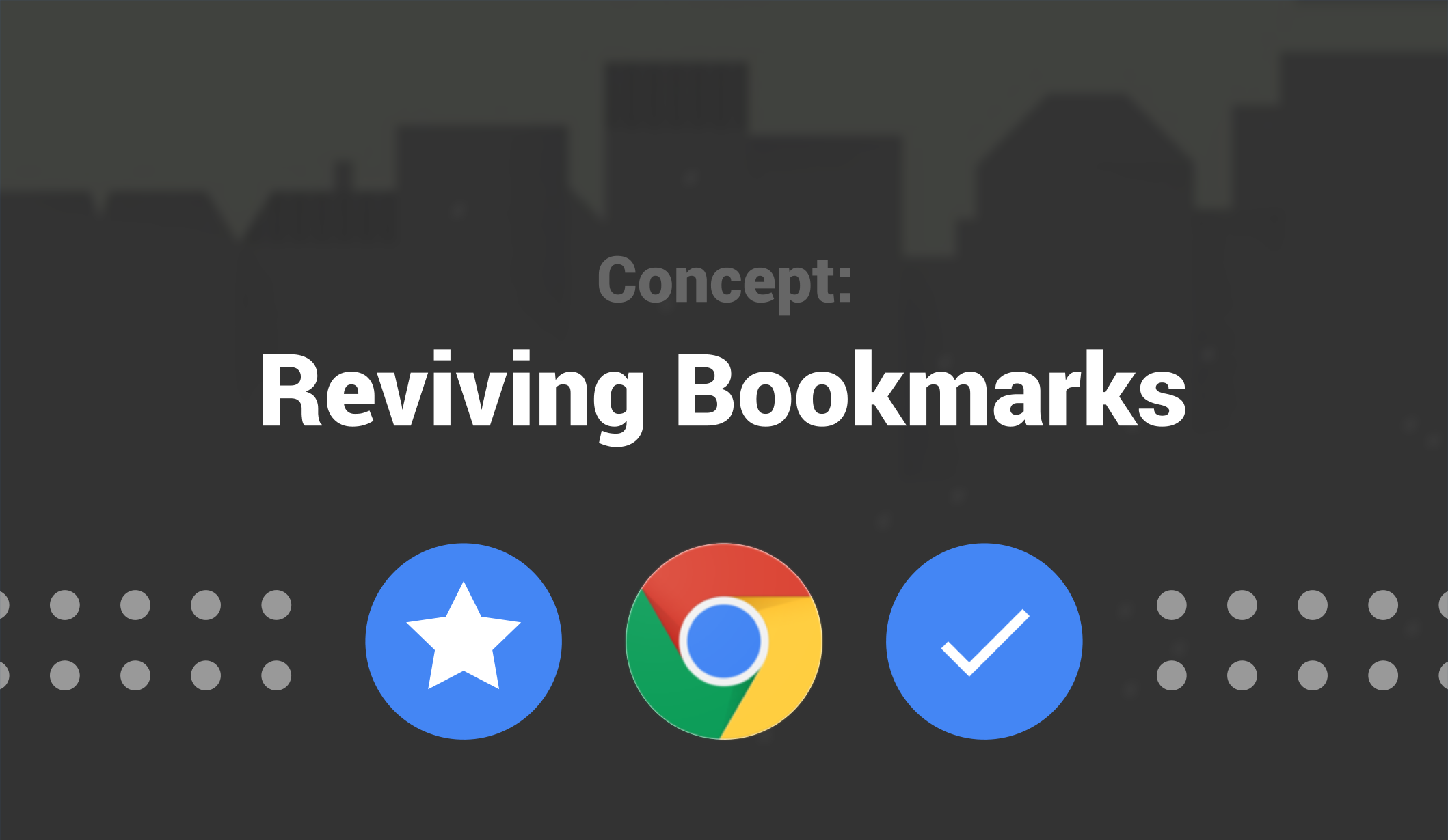
However, following a big backlash from beta users, Google Stars appears to be dead. Besides many small flaws, the biggest problem with Google Stars was in my opinion that it had the same fundamental problems as it's predecessor.
As someone who always wanted to, but never really got into bookmarks, I was very disappointed and asked myself what Google Stars maybe should have done different, and what might had been able to revive bookmarks. And I'm convinced that the solution presented in this concept, which focuses on a reworked favorites bar, is actually capable to do this and to finally carry browser bookmarks into 2015!

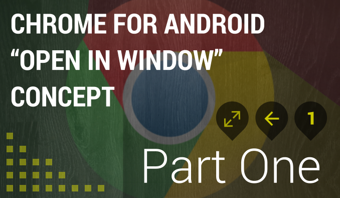
Using Google Chrome on Android, you could either simply open it and then awkwardly navigate back once you’re done, forcing the previous site to load anew and losing your position. Or you could alternatively open it in a new tab, which however on mobile requires many manual actions and thus is a similar uncomfortable experience.
Even if opening links in new tabs worked more stable on mobile devices, it would most likely often still not fit that well after all. The reason for this is that people are browsing different on their mobile phones. Whereas it’s easy to keep track of many tabs on a PC, users are more ‘focused’ on mobile devices.
The option to open links in “windows” aims to fill this gap of quickly getting to know what’s behind a link and is specifically made for the way people are browsing on mobile phones.
Instead of coming up with a better solution, manufacturers are currently trying to temporarily transform your tablet into a laptop. Of course new software solution will still be far away from the typing experience offered by a hardware keyboard, but at least the gap between the two could be significantly smaller.
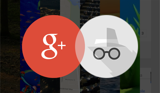
Thanks to Android, hundred millions of users all over the world already have Google+ pre-installed, and Google should finally take real use of this. Currently, if someone opens the Google+ app - maybe per accident or because of curiosity - he is halted by a characterless screen-filling sign in page. Google+ already has a bad reputation because of all this login stuff, and for a new user this login screen might just be a verification and the reason to leave the app again.
Instead, Google+ could act more like YouTube, giving the user the possibility to discover it’s advantages and greatness without the direct need to sign up first. Of course Google+ and YouTube are very different services, but the concept could certainly be applied anyway. While this might not work for most social networks, Google+ is a very underestimated service, with an overwhelming user experience, that could be capable to convince users to voluntarily sign up permanently after testing it for a while.
But what I’ve also seen a lot in this context, probably the second largest amount of comments, were tweets from people, who were more neutral towards the new character limit and instead pointed out how they would much rather like an edit functionality being introduced. Which, again, in several cases lead to replies from others explaining how this would be an even worse idea. Some of these conversations also were kinda constructive and came to results such as that a short time interval after sending a tweet to correct typos might be acceptable.
Coming from Google+ and seeing how editing also got through without constant and big hazards on Facebook, I really also don’t think it would be a big deal on Twitter also without time limits.
Nonetheless, I want to show with this concept an edit functionality that would even fulfill the demands of more cautious users, who believe that normal editing unlike on Google+ and Facebook would be more problematic on Twitter, while not restricting the feature in terms of time or how often tweets could be edited.
Thus I think it’s very possible that one might find oneself in a situation, where you’ve got a lot of relevant tabs open in incognito mode, which you don’t want to close yet, but you might also want to replicate the initial experience of a new incognito window and all it's advantages. That is where this concept’s feature would turn out useful.
As you can see in the concept image at the top, the idea is really straightforward: right click on an incognito window to access a new option to “Clear incognito cache”, which would clear all cookies and other data amassed during the current incognito session, but with all tabs staying open.
As you can see in the mock-up above, this concept imagines a new Site info-feature that would be built directly into Chrome’s overflow menu and solely focused on all kinds of site-wide features. So besides sharing, printing or bookmarking http://viewout.net/2016/03/10/concept/Google-Chrome-Android-Site-Info-Concept, this would be the place to overview and control everything related with the overall website viewout.net, like changing the permissions you once gave to it, having access to saved passwords and much much more.
It’s little surprise then to see Android Nougat again focusing a lot on that aspect, introducing things such as a new look for notifications, grouped notifications, new & more highlighted control options and a new direct reply implementation for messaging apps.
At first, all these updates might not sound like much and kind like like not needed updates and catch-up features. Actually, however, I’ve found that they’re a lot more significant than their names and first appearance might suggest, perhaps even displaying the greatest advancement to Android’s notifications since 2011’s introduction of actions and resizing, as they appear to be just the beginning of a deeper rethought of the system’s notification system.
And until today - countless new iterations, a new name, several complete overhauls and the introduction of a new main feature with music subscriptions later -, this core concept and type of cloud integration is still what defines the service and sets it apart from the competition.
But though a cloud service at its very core, one thing that has not progressed, and which makes Google Play Music feel strangely unconnected today, is the still local-only listening experience. Instead of a unified, cloud-based implementation, every device still has it’s own local music queue and, even worse, own local music history and often thereof based suggestions, leading to many small, divided experiences in all the different places that a user is interacting with the service.
Thus, I’ve decided to create this list with some less obvious aspects that self-driving cars could fundamentally change, also beyond the usual stuff like that they are way more secure than we human drivers. Of course the majority of people certainly understands that it’s about more than just ‘who is driving’, but I think it’s interesting anyway for everyone to try and think on the one hand side more openly about this rising technology, as well as about a few more concrete ideas what changes might come with it, perhaps even touching science fiction to a certain degree.
Today however, this big strength appears to be rather underutilized. On the desktop, Synced Tabs have been downgraded to being just a part of Chrome’s “recent tabs” menu, which also includes 2-3 recent links from other connected devices. Of course it can still be very useful that way, but in first place, Google is making Synced Tabs a niche feature, and this despite the ever increasing role of smartphones, mobility and cross-device browsing.
To take full use and fully accelerate the growing potential of this feature, this concept imagines how Synced Tabs could be implemented in a better way. Considering just how few Chrome’s UI has changed over all the years, the idea presented in this concept might actually display the biggest shift in user experience ever for Chrome, though I’m convinced that this would be the right step and pay off.
However, following a big backlash from beta users, Google Stars appears to be dead. Besides many small flaws, the biggest problem with Google Stars was in my opinion that it had the same fundamental problems as it's predecessor.
As someone who always wanted to, but never really got into bookmarks, I was very disappointed and asked myself what Google Stars maybe should have done different, and what might had been able to revive bookmarks. And I'm convinced that the solution presented in this concept, which focuses on a reworked favorites bar, is actually capable to do this and to finally carry browser bookmarks into 2015!
Using Google Chrome on Android, you could either simply open it and then awkwardly navigate back once you’re done, forcing the previous site to load anew and losing your position. Or you could alternatively open it in a new tab, which however on mobile requires many manual actions and thus is a similar uncomfortable experience.
Even if opening links in new tabs worked more stable on mobile devices, it would most likely often still not fit that well after all. The reason for this is that people are browsing different on their mobile phones. Whereas it’s easy to keep track of many tabs on a PC, users are more ‘focused’ on mobile devices.
The option to open links in “windows” aims to fill this gap of quickly getting to know what’s behind a link and is specifically made for the way people are browsing on mobile phones.
Instead of coming up with a better solution, manufacturers are currently trying to temporarily transform your tablet into a laptop. Of course new software solution will still be far away from the typing experience offered by a hardware keyboard, but at least the gap between the two could be significantly smaller.
Thanks to Android, hundred millions of users all over the world already have Google+ pre-installed, and Google should finally take real use of this. Currently, if someone opens the Google+ app - maybe per accident or because of curiosity - he is halted by a characterless screen-filling sign in page. Google+ already has a bad reputation because of all this login stuff, and for a new user this login screen might just be a verification and the reason to leave the app again.
Instead, Google+ could act more like YouTube, giving the user the possibility to discover it’s advantages and greatness without the direct need to sign up first. Of course Google+ and YouTube are very different services, but the concept could certainly be applied anyway. While this might not work for most social networks, Google+ is a very underestimated service, with an overwhelming user experience, that could be capable to convince users to voluntarily sign up permanently after testing it for a while.

|

|

|
Thus I think it’s very possible that one might find oneself in a situation, where you’ve got a lot of relevant tabs open in incognito mode, which you don’t want to close yet, but you might also want to replicate the initial experience of a new incognito window and all it's advantages. That is where this concept’s feature would turn out useful.
As you can see in the concept image at the top, the idea is really straightforward: right click on an incognito window to access a new option to “Clear incognito cache”, which would clear all cookies and other data amassed during the current incognito session, but with all tabs staying open.
And until today - countless new iterations, a new name, several complete overhauls and the introduction of a new main feature with music subscriptions later -, this core concept and type of cloud integration is still what defines the service and sets it apart from the competition.
But though a cloud service at its very core, one thing that has not progressed, and which makes Google Play Music feel strangely unconnected today, is the still local-only listening experience. Instead of a unified, cloud-based implementation, every device still has it’s own local music queue and, even worse, own local music history and often thereof based suggestions, leading to many small, divided experiences in all the different places that a user is interacting with the service.
However, following a big backlash from beta users, Google Stars appears to be dead. Besides many small flaws, the biggest problem with Google Stars was in my opinion that it had the same fundamental problems as it's predecessor.
As someone who always wanted to, but never really got into bookmarks, I was very disappointed and asked myself what Google Stars maybe should have done different, and what might had been able to revive bookmarks. And I'm convinced that the solution presented in this concept, which focuses on a reworked favorites bar, is actually capable to do this and to finally carry browser bookmarks into 2015!
Instead of coming up with a better solution, manufacturers are currently trying to temporarily transform your tablet into a laptop. Of course new software solution will still be far away from the typing experience offered by a hardware keyboard, but at least the gap between the two could be significantly smaller.
|
|
|

|
|