|
Viewout
|
|
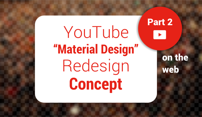
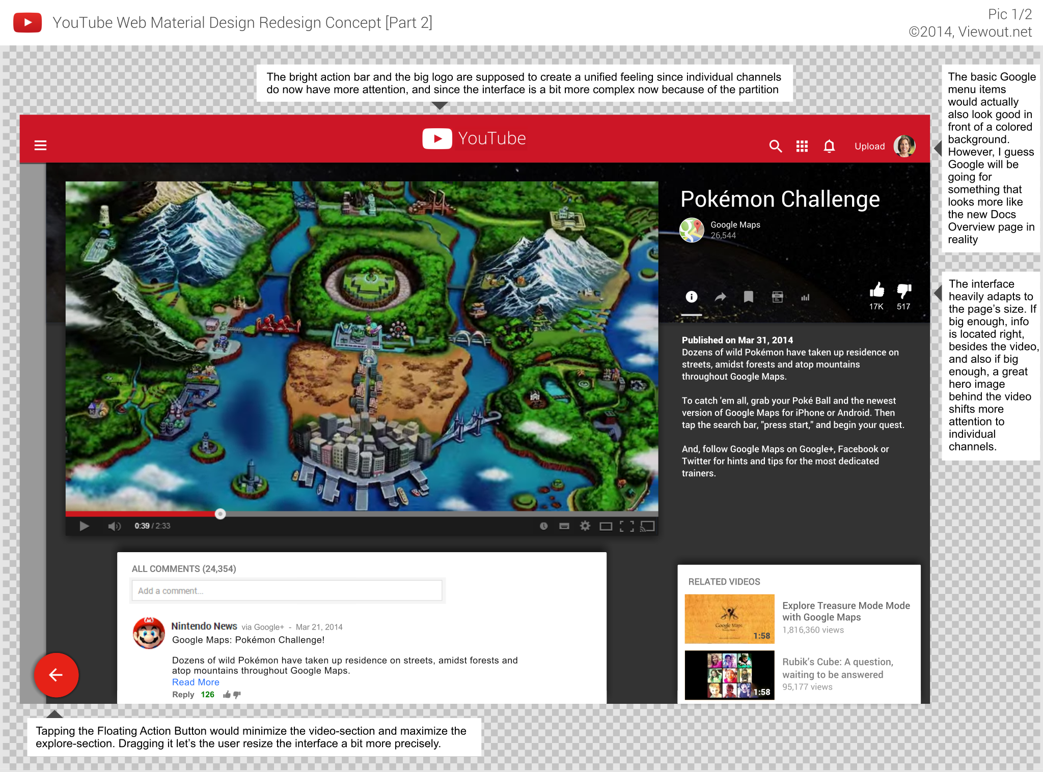
About three weeks ago, I published an article imagining a Material Design update of YouTube on Android. This concept here, however, turned out to be actually more than just a simple design refresh. Instead, it’s a complete reimagination of how YouTube works, and of how the user uses the service, laying a greater focus on channels and aiming for a new, TV-inspired atmosphere.
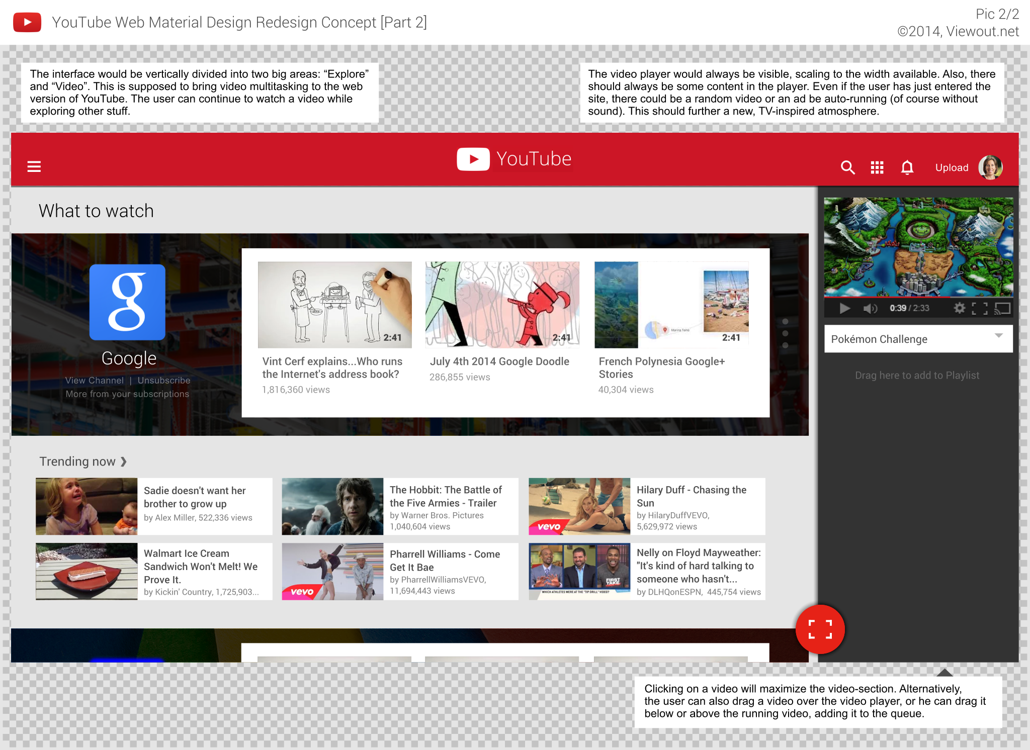
The new site would be vertically divided into 2 big sections: “Exploring” and “Video”. Since the two sections share the same space, expanding one section automatically reduces the width of the other one. The aim of this partition is to bring video multitasking, which is part of YouTube’s mobile apps since August 2013, to the site.
The widths of the two interfaces could be resized dragging the floating action button. Tapping on the button maximizes the currently smaller section. Both interfaces do of course heavily adapt to the space available. In contrast to the content in the “Explore”-section, the video player would always be visible.
When the user searches for example for something, the results would appear in the Explore section. Clicking on one of the results would not lead to a completely new page anymore, but instead the video would start running in the already visible videoplayer, with the video-section getting maximized. The user might then either watch the video, or he could also minimize the video-section and continue searching while the video keeps running pinned on the right side.
The video player should not only be always visible, but it should also always contain some content. Even if the user has just entered the site, there could be a commercial spot or a random video out of the users subscriptions be running (of course without sound). This is also supposed to further said TV-inspired atmosphere on YouTube.
As long as the user does not choose a video himself or interacts with the player, new automatically running, randomly chosen videos would follow one after another. User-selected videos, or videos which the user has interacted with (paused, hovered) would of course still not simply go away after they’re over, but instead continue to suggest similar videos and give the option to replay the video.
The user can alternatively also start a video by dragging it over the player, or, he can drag it below or above the running video, adding it to the queue. Thus, the queue feature would be prominently and intelligently implemented, gaining much more attention, and thus already preparing the whole service for the upcoming music subscription service.
If the video-section is big enough, a big hero image of the videos channel would not only make the otherwisely dark interface more friendly and "Material Design"-like bright and colorful, but it would also shift more focus onto the individual channels. The user would notice easier on which channel he is watching a video and when he would leave it. This would yet again also lead to a more TV-level experience and shift more importance to individual channels and users.
The bright action bar and the very large YouTube logo are supposed to still obtain an unified, ubiques feeling, even though there’s now a greater focus on the individual channels.
I could imagine the radical design changes (e.g. bright action bar) arousing much criticism again, thus it might be intelligent to only slowly introduce the new interface, maybe through a beta version, and making adjustments based on the users reactions.
Independent from the look, however, I think the new layout would not only to work out very well in reality, but I also think it might be received well by YouTube users, as long as it’s presented right, easily understandable with explanations at the first visit.
Again, you should notice that the real implementation would of course - all Material Design-like - be animated, with smooth transitions making it even easier for the user to understand how the interface works.
I understand that this might be harder to understand than the first part, thus if you have any questions, just ask!
What do you think about this concept? Do you think multitasking would increase the experience? Would you be happy about an a bit more TV-inspired atmosphere?