
|
Viewout
|
|


Today however, this big strength appears to be rather underutilized. On the desktop, Synced Tabs have been downgraded to being just a part of Chrome’s “recent tabs” menu, which also includes 2-3 recent links from other connected devices. Of course it can still be very useful that way, but in first place, Google is making Synced Tabs a niche feature, and this despite the ever increasing role of smartphones, mobility and cross-device browsing.
To take full use and fully accelerate the growing potential of this feature, this concept imagines how Synced Tabs could be implemented in a better way. Considering just how few Chrome’s UI has changed over all the years, the idea presented in this concept might actually display the biggest shift in user experience ever for Chrome, though I’m convinced that this would be the right step and pay off.
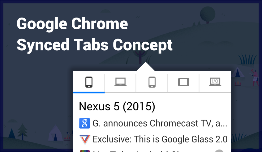
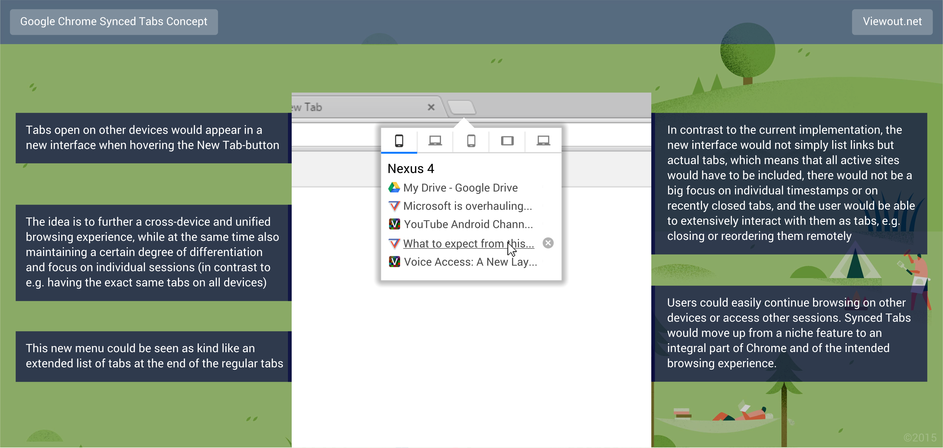
As you can see in the concept picture, the core of this concept is a new menu, which would appear when hovering the New Tab-button and show tabs active on other devices. While this would certainly be a very prominent position, it would also be a very logical one, considering this new menu as kind like an extended list of your tabs.
It’s important to understand that this new menu would not simply be a bland collection of links, but it would show actual, real tabs that the user could fully interact with and integrate into his browsing routine just as he does with other, normal tabs. What this means is for example that the user would be able to close a tab or open a link on another device remotely.
What this also means is that always all tabs from a connected device would have to be listed - if only the last few visited sites would be shown or if recently closed tabs would be included as well, it would no longer be a real view on what’s going on another device and the intended vision of a big, unified tab manager across devices would be lost.
Further more, this interface should also always be rather subtle and unobtrusive, rather displaying a possibility or an option to the user. Because of this, the menu should always stay small, with a scroll bar already appearing when just more than 6 tabs are listed.
I’m aware of the typical problems with mouse-over elements, but even if Chrome would for some reason lag, the experience would not be lower than it currently is, keeping in mind that no elements that are in the new menu have been accessible more easily before.
Dragging tabs and links from another device into your current session or vice versa, closing tabs remotely or just having a quick overview on what’s going on on all of your devices are all ways to take advantage of this new feature. Another idea that would be really interesting is to reorder tabs from other devices remotely, though this would only be possible in a very limited way because it would not work with merged tabs on Android, and it also would not work when not all tabs would be on the same window on the desktop.
In contrast to for example having the exact same tabs open everywhere, a core idea behind this concept is to bring the different devices that Chrome is used on closer together, but at the same time also maintain a certain degree of differentiation and focus on individual sessions.
I think it’s easy to think of dozens of different situations in which this feature could prove useful, and it’s just as easy to see it quickly becoming a fundamental part of many user’s browsing habits. It might be a big and risky UI change, but I’m convinced that it would be worth it!
What’s your opinion? Are you often taking use of Chrome’s Synced Tabs? Do you think that this concept would work well? On how many different devices are you regularly using Google Chrome in average?
Follow Viewout on on Facebook, Twitter and Google+ to stay in touch with new concepts and articles!
