
|
Viewout
|
|


While it’s an easy task to quickly open (and close) a link in a new tab on PCs today, demanding not more than 2-3 clicks, it’s a totally different experience on mobile devices.
Imagine for example a comment on some web article includes an Imgur link. Using Google Chrome on Android, you could either simply open it and then awkwardly navigate back once you’re done, forcing the previous site to load anew and losing your position. Or you could alternatively open it in a new tab, which however on mobile requires many manual actions (at least 6 steps) and thus even though you retain your position on the original site is a similar uncomfortable experience.
Even if opening links in new tabs worked more stable and fluidly on mobile devices, it would most likely often still not fit that well after all. I think the reason for this is that people are browsing different on their mobile phones. Whereas it’s easy to keep track of many tabs on a PC, users tend to be more ‘focused’ on mobile devices, for instance being always just concentrating on one page.
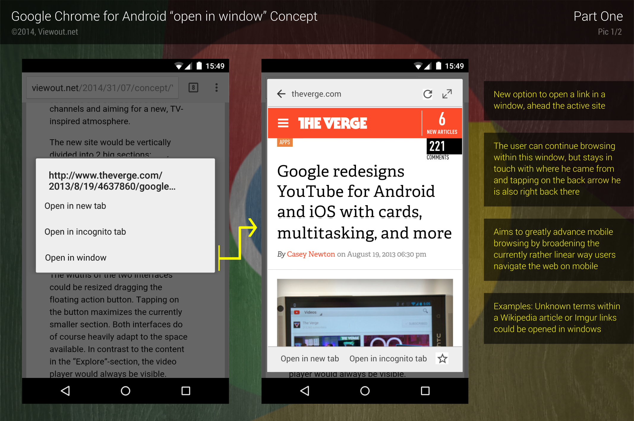
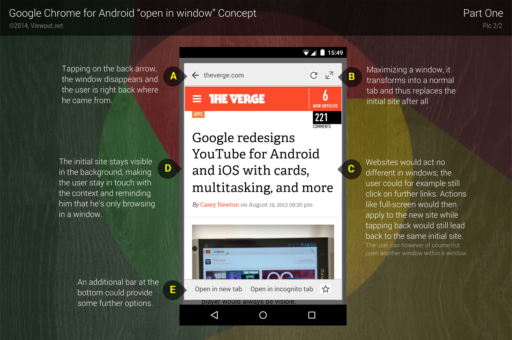
As shown in the concept pictures, the option to open links in “windows” aims to fill this gap of just quickly getting to know what’s behind a link and is specifically made for the way people are browsing on mobile phones.

As the name suggests, choosing this new option would open a link in a simple window ahead of the active site. The user could then either continue browsing within this window (e.g. clicking on further links), but at the same time always stay in touch with where he left. And clicking on the back button, the window would directly disappear and the user would be right back where he initially came from.
This might sound a bit vague at first, with real advantages not directly recognizable, but by building upon the currently rather linear mobile browsing experience, this feature could greatly redefine the way people navigate through the internet.
There are a whole lot more examples just emphasizing the strengths of this feature. By adding a completely new layer to the interface, users could navigate the web in a new, very ordered and organized way, which seems just right for this ‘focus’ with which people are already browsing on their phones now.
Adapting to a different user behaviour and simplifying general functionality from the PC for your phone, this feature could greatly improve and push mobile browsing forward!
What do you think about this concept? Would this feature really be such an improvement, or maybe rather just an unnecessary new option, cluttering the UI? Do you think it might actually have such a great influence on the mobile browsing experience as it is described in the article?
You can also follow Viewout on Facebook, Twitter and Google+!
