|
Viewout
|
|
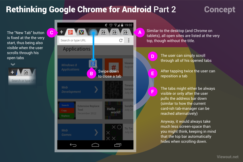
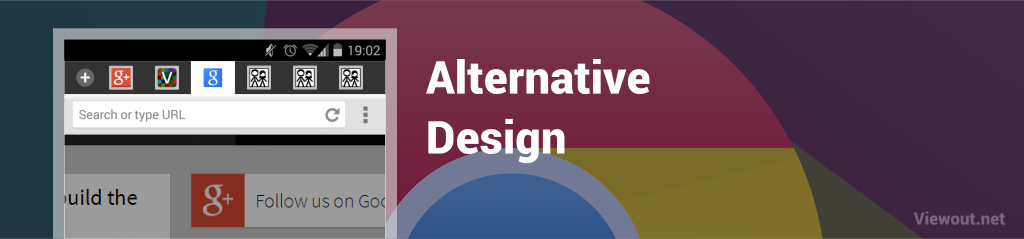
So again I’ve taken some time and worked on another, slightly different idea. As shown above, this time I’m aiming even more for a desktop-inspired interface, placing real tabs on the very top. Google has already something very similar for Chrome on tablets, but this concept goes a bit further, adding new gestures to manage tabs better also on touch devices. The same ideas might easily be added to the tablet version, too.
As you can see, the tabs look pretty similar to pinned tabs on the desktop. Swiping a tab down closes it, which I think is a very quick way and can be infinitely useful. If the user has more than about 5 or 6 tabs open, he can of course scroll horizontally through the list of tabs - just like on the tablet version too. Tapping twice on a tab gives the possibility to reposition it.
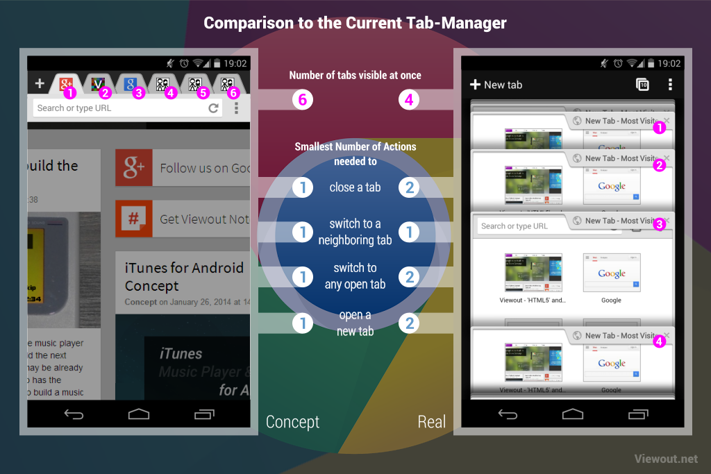
As already with the first concept, the great advantage is that there are much more tabs visible at once. More so, the user would be able to reach and interact with his tabs much faster and would gain a much better and cleaner overview.
I’m confident that this would shoot mobile browsing miles forward and much closer to the PC experience. In fact, the date writing this, I don’t see any real disadvantage. Nevertheless, as also already with the first concept, Google should act transparent and flexible and give the possibility to choose between the new and the old layout.
You might argue that this would take much more screen space, but in fact Google Chrome already automatically hides the top bar when scrolling down now. And if it would disturb you anyway, there could certainly be an option to hide it by default and only make it appear when the user drags the address bar down - the same way can also already the current tab-manager be reached since an update some months ago.
Below you can see an alternative design, but I think Google should go with the first one for reasons of platform consistency. What’s your opinion? Do you also believe that this update would be an unbelievable great addition? Do you like this one or the first concept with the Navigation Drawer more?