
|
Viewout
|
|

And until today - countless new iterations, a new name, several complete overhauls and the introduction of a new main feature with music subscriptions later -, this core concept and type of cloud integration is still what defines the service and sets it apart from the competition.
But though a cloud service at its very core, one thing that has not progressed, and which makes Google Play Music feel strangely unconnected today, is the still local-only listening experience. Instead of a unified, cloud-based implementation, every device still has it’s own local music queue and, even worse, own local music history and often thereof based suggestions, leading to many small, divided experiences in all the different places that a user is interacting with the service.
For instance, you could be listening to a new artist for days on your phone, but switching to another device this artist wouldn’t be found anywhere in your music or suggestions unless you search for it. Or you could be listening to a long queue of several hundreds of songs and would have no possibility to continue listening to it on another device. Especially in the context of more and more personal computing devices, like smartwatches, in completely new device categories hitting the market and one day becoming independent from your smartphone, this problem will only get worse.
I personally really like Google Play Music and sincerely hope that Google won’t discontinue the service anytime soon, and I think that striving for a more unified, cloud-based listening experience seems like a good way forward. And while making the history and suggestions on the different devices more connected to each other might greatly improve, but not really alter the actual user experience, this concept focuses on implementation ideas and the impact of an advanced, cloud-based music queue implementation.

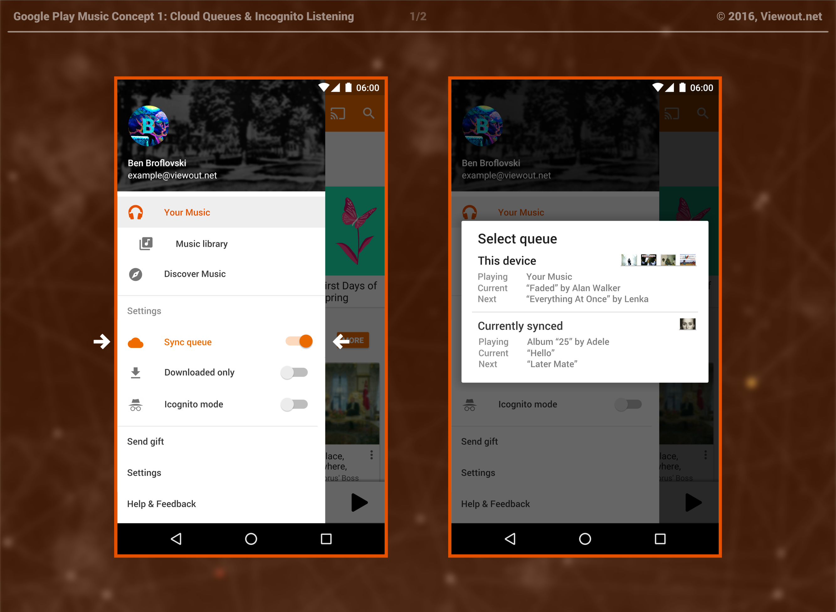
The idea of having one unified music stream across the service is of course very simple and will surely rank high among Google Play Music’s most requested features. I think there are basically two directions Google could take with the implementation, either making it very automated and intended as the very default way the service should be used, or giving the user more control over it, for example with a quickly accessible toggle, as in this concept one being placed in the navigation drawer.
The user could then decide himself on every device whether to sync with the cloud queue or whether to listen only locally, as well as also be able to repeatedly and quickly switch between those two options on one device (the automated approach might even have a similar option, but deep hidden in the settings).
When connecting a previously non-synced device with the cloud, the user could choose whether to copy the cloud’s queue to the device or whether to make the device’s till-then-local queue the new cloud one. Moreover, the feature would not interfere with the currently already available “Downloaded only”-option, as non-downloaded songs could simply be skipped locally and in the cloud, and problems after listening to music on a synced device while it was not connected to the internet only occur when the cloud queue has in the meantime changed, because music was for example listened on another device, in which case the user could choose which queue to keep online as well.
The obvious disadvantage of this implementation would be it’s higher level of difficulty for new users in contrast to just having it active by default for all (and providing a less dynamic checkbox in the settings). Though probably not much harder to understand than Play Music’s surprisingly powerful queue implementation is already now, the prompts may confuse new users and many might end up not taking use of the feature for no apparent reason (eg randomly turning it off and ignoring the toggle and whole feature from then on).
All in all, however, I would clearly prefer this concept over the more automated approach. Mobile applications often aim for enorm simplicity, but with I think actually only quite few problems for novice users, it’s an easy, mobile-friendly implementation of an enormously powerful feature for more interested users.
Most of all, I think this would be a very transparent and clear to understand concept. Whereas too much automation already often makes services appear unstable or to act unreasonable - I think it’s just too easy to imagine getting mad with the service syncing the wrong queue or being unsure how it’ll react in certain situations like after listening without an internet connection -, it would in this case actually also narrow down the experience quite a bit.
Several people listening on the same account, for instance, would basically become impossible simultaneously, but also at different times it would become rather inconvenient having to always start off where the other person left off. But also just using the service alone and as intended, this undynamic approach would lead to problems, like for example when you want to select different music while someone is at your house, but don’t want to loose the music queue you are currently listening to.
There are many more such examples, and even though most are rather minor annoyances, the overall experience would just become much more powerful if users were able to decide whether specific devices should be linked to the cloud and if this feature was intended as an integral part of the experience. In contrast to the more standard automated approach, Play Music could adapt greatly to all kinds of personal situations, becoming a much more user-centric service.

Pushing the queue concept even further, a second small idea I want to present within this concept is the introduction of a Chrome-inspired incognito-mode for Play Music.
As with many Google products, algorithms and intelligent features making the most out of your data are also a big part of Google Play Music. Implemented right, such techniques are what make Google’s user experiences such great and unique, and if I have control over my data, I’m even ok with Google using it to show me personalized ads and thus earning their money.
However, I think it’s important to offer a quick way to turn this tracking on and off, not only because users might then feel more secure and free when interacting with the service, but it would also be in Google’s own interest, enhancing their services much more beyond just being more privacy-friendly:
Imagine you want to look up the music of some ‘embarrassing’ artist for some reason, or a friend of you wants to show you a strange song he likes, or you want to play childs music at your kid's birthday party. And the next thing you remember is online ads for that shameful artist, your friends obscure music popping up all over in the Play Store, or suggestions or the intelligent playlists in the Music app itself being suddenly based on those songs for children.
Those are all exceptional situations, and if users were able to consciously express this and tell Google not to track and that this is not their actual music taste, the app’s algorithms and intelligent features could greatly benefit as well.
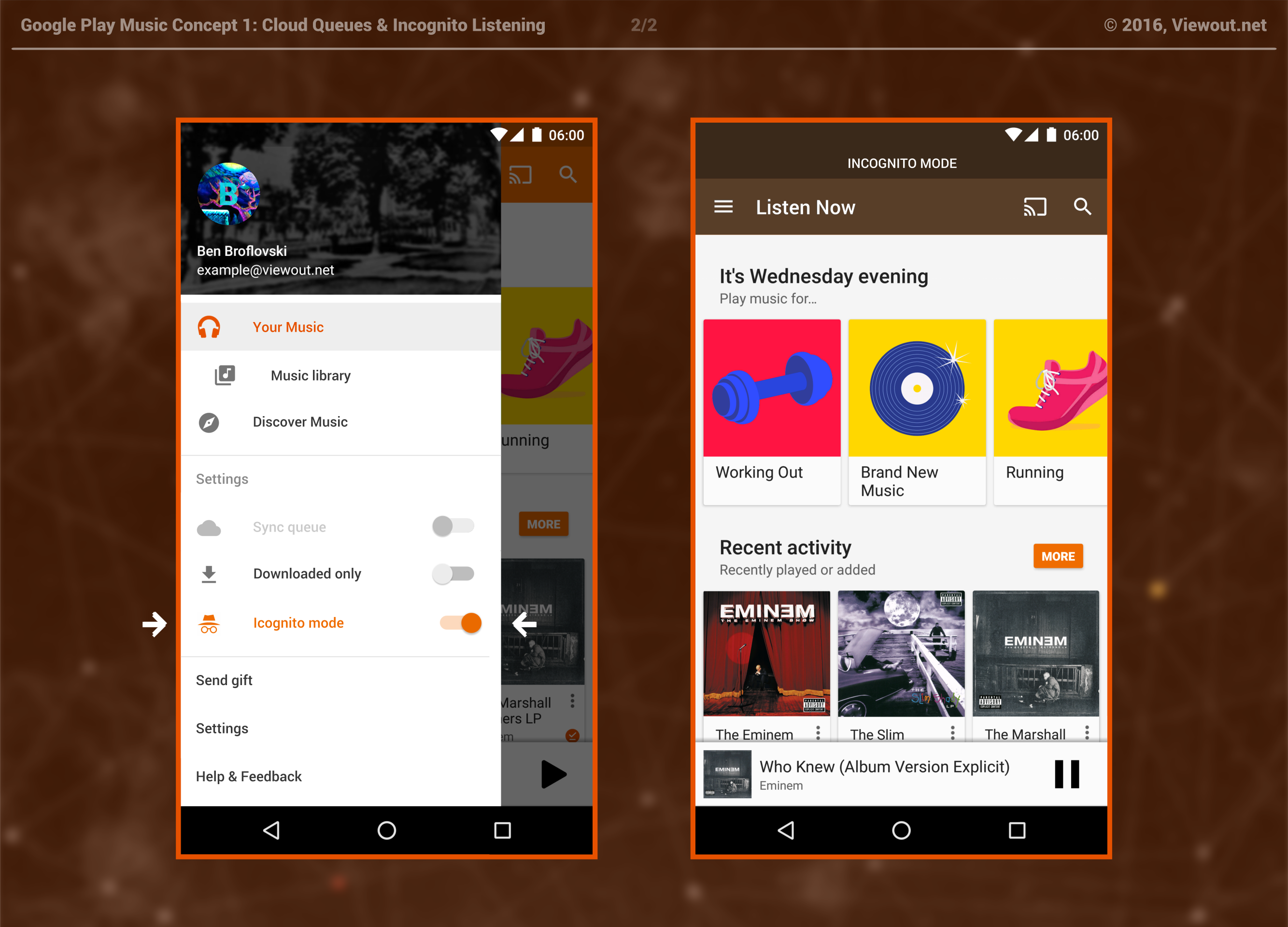
The incognito-feature would work just as one would expect it to. When enabled, searches and songs you listen to wouldn’t be remembered. A banner similar to the one that appears when “Downloaded only” is enabled, as well as a different app bar color would highlight that this mode is active.
Because Google Play Music is not a multitasking-centric application like a browsers like Google Chrome, the incognito feature would here actually be a real mode that the whole app is either in or not, affecting the entire experience. Furthermore, because of this and because there would also be no possibly dangerous 3rd parties involved as with websites in browsers, Google could choose to implement the incognito feature less strict and more seamless than in Google Chrome, as for example with the same listening queue remaining while switching between the two modes (though perhaps deleting previous tracks when exiting the incognito mode).
However, implementing the feature more akin to Chrome appears to be the much more preferable choice, not only because those two products would then be more similar, but also because it seems to be overall like a more standard way, that could be better employed to even more services in future. Implemented that way, the incognito mode would feature an own music player and queue, which would be empty at start and completely deleted when exiting the mode. The normal music player would meanwhile stay completely untouched, with also its main queue coming back unchanged once the user switches back to normal listening again.
An increased difficulty would again be a disadvantage, though since this would basically just be a simplified version of Chrome’s already very well-known incognito mode, this would even less be a problem here than with the first concept.


|


|


|


|
So to sum things up, both of the two concepts presented within this article would actually be quite minor features, but both with a big impact on the user experience, pushing the service in a much more user-centric direction. Play Music could become much better at adapting to all kinds of personal using scenarios and, with I think a thoughtful approach and very few disadvantages, the user experience could level up greatly.
Especially the cloud queue-implementation appears as it would rather complete the cloud-centric service that Google Play Music has always been instead of being a big add-on, while the incognito mode could enhance privacy and transparency, encourage discovery of new music, help convey the system of Google’s meaningful utilization of user data, and it could also improve the app’s intelligent features from the user's perspective with better suggestions and features, as well as even also improve Google’s algorithms overall.
(And not at least, with the bottom navigation bar now being an official part of the Material Design specifications and the reporting of many tech sites on this suggesting the end of the hamburger menu and seeing the only reason the navigation drawer will now be used in being capable of holding more than 5 buttons or as a fancy alternative, I think the two concepts also clearly show why else there’s still a bright future and lots of potential in the drawer for app design, being able to handle more complex interface concepts and implementations than the static bottom navigation bar buttons ever will. Where else could the toggles otherwise always be that quickly accessible without disturbing the main experience?)
But what do you think? Do you use Play Music and would you like to see Google implementing those two features? Do you prefer more automated or controllable experiences in mobile apps?
