|
Viewout
|
|
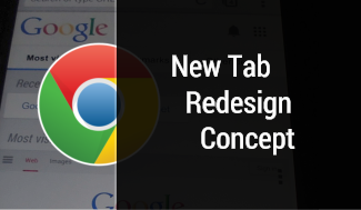
Google Chrome has gone a long way on smartphones and is a whole lot of fun to use today (after the last update with the new gestures maybe even more). The ‘New Tab’ page, however, is a mess on both, Chrome for Android and on the normal desktop version. And this although it’s probably the first site a lot of users get to see first after starting the application everyday.
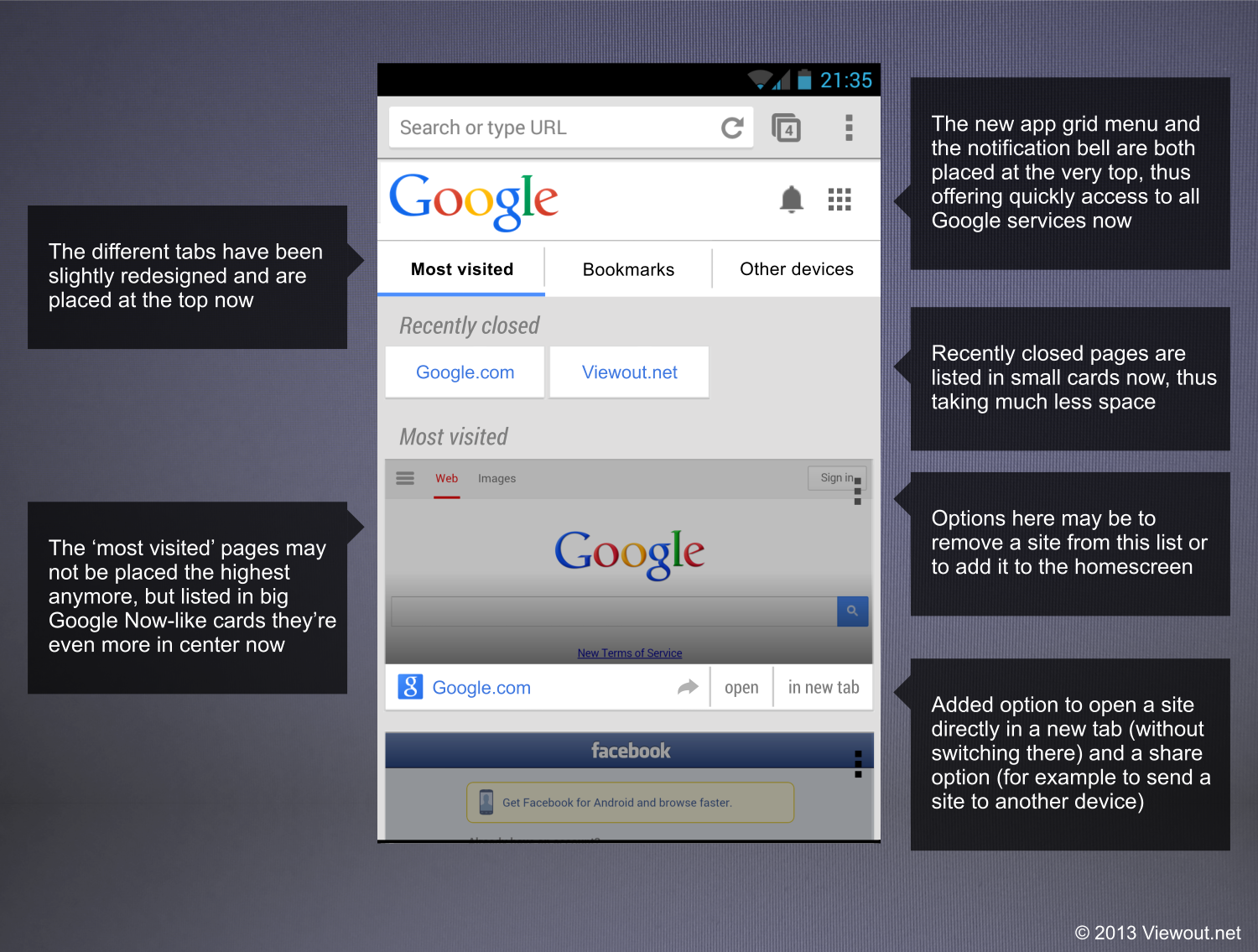
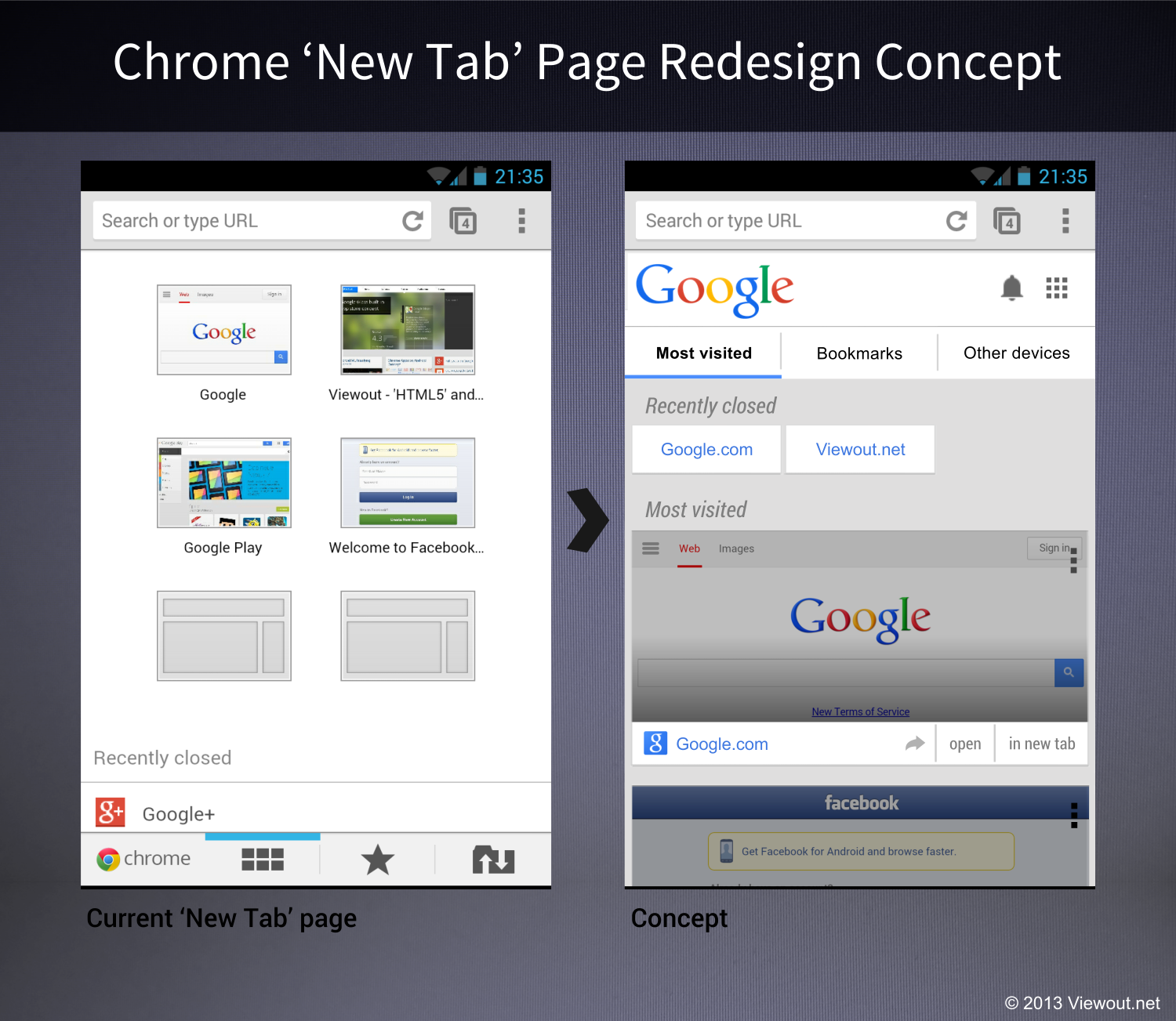
This concept deals with a redesigned ‘New tab’ page for the mobile version. First, the new grid app menu has been added directly at the very top, alongside the notification bell and a Google logo.
Below this the tabs ‘Most visited’, ‘Bookmarks’ and ‘Other devices’ have been placed. This menu has also been slightly redesigned, thus being now more consistent with other Google services and looking up-to-date.
The list of ‘Recently closed’ sites has also been moved from the very bottom to the top, which indeed also makes more sense, as a user certainly wants to find accidentally closed tabs as fast as possible.
Then (finally) the ‘Most visited’ pages are listed. There may be still not more than 6-8 of them, but they do now take much more space, as they are much larger. Google Now’s card interface has been adapted here. The biggest part of the cards is filled by screenshots, though a new bar has been added at the bottom, containing new options, such as a separate button for opening the site in a new tab (which could of course also be done by simply holding on the icon) and a share option.
I think that this ‘New Tab’ page would not only look really great, but it should also not be too hard to implement for Google. Even though Google may create this page like a normal website, this does not automatically be a disadvantages anymore. If you take a look at the redesigned Google mobile page, for instance, you can see that mobile pages nowadays can look great, too.