|
Viewout
|
|
This ambiguous relationship might also be seen best at the example of YouTube’s UI design. After receiving a great redesign in late 2012 - which aligned the service to Google’s back-then new clean style - the company had to face much criticism.
And also YouTube’s Android app seems partly rather unsure about what it wants to be: of course the last great update in August 2013 brought in Google’s popular card scheme. But still without a colored Action Bar and still with a half transparent Navigation Drawer, the service is far less a reference app for Android design than most other Google apps. This is even more surprising considering that YouTube once was a reference app on the original iPhone.
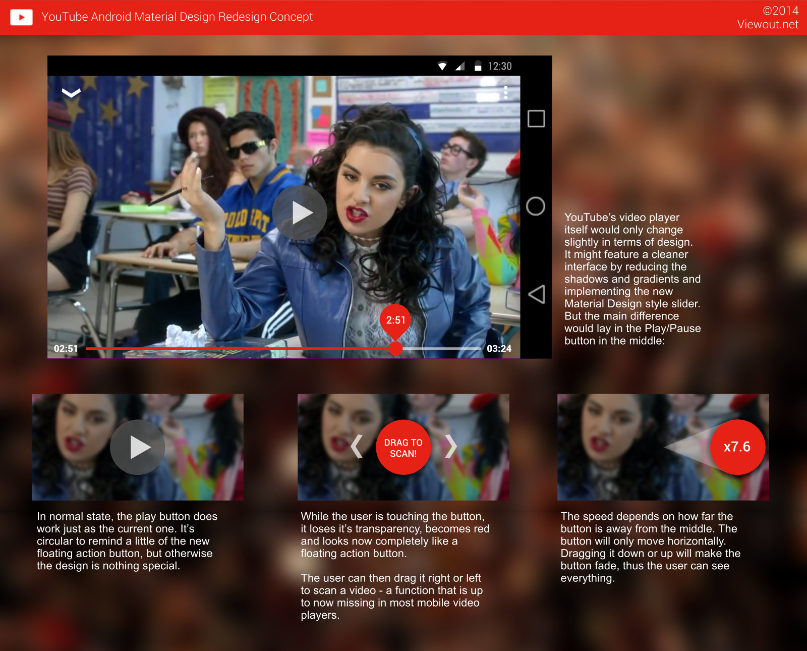
It was most likely unintentionally, but the way you can minimize videos in YouTube’s mobile apps since the latest update clearly follows the main aspects of Material Design: motion and meaningful transitions. It might not yet be as polished, but similar to Material Design, the video is placed fixed, clearly above the other content when minimized, and when expanding it, it animates smoothly showing where the new content comes from, thus making the user understand the whole interface.
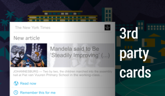
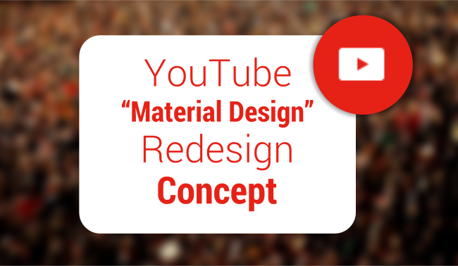
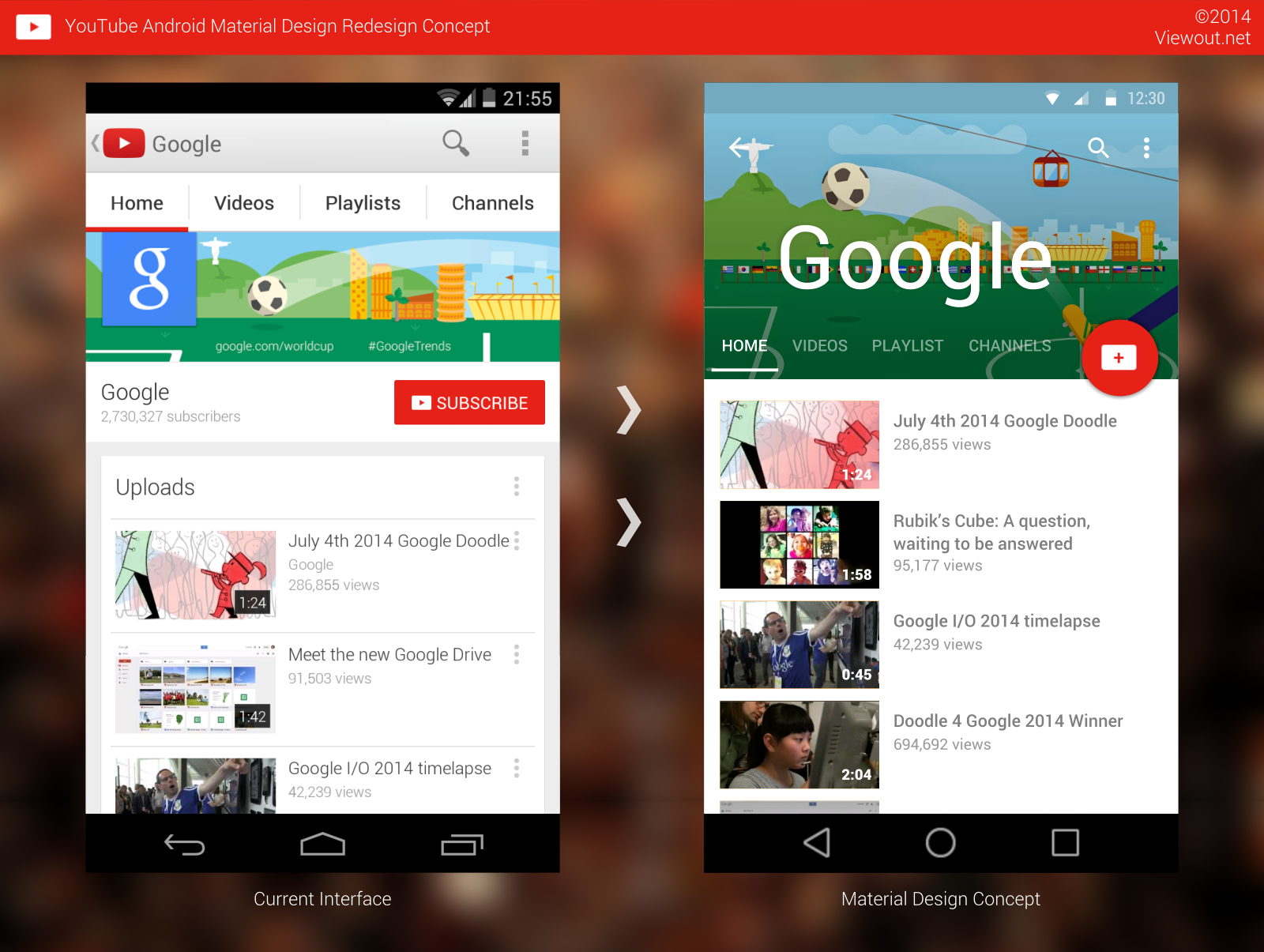
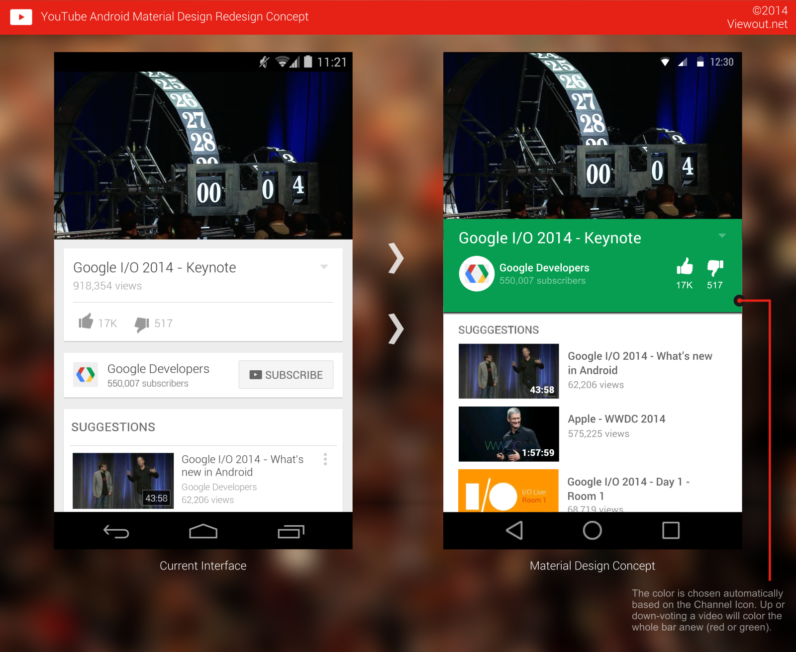
So this concept imagines a redesign to the YouTube Android app explicitly following the Material Design guidelines. I guess the mock-ups and pictures do mostly explain themselves. It’s very interesting to imagine any app being rethought with Material Design, but YouTube - which is part of Google - might actually never feature it as deeply implemented as imagined in this concept.
I think this concept has turned out very good looking. I can actually imagine how this all could work out in reality, even though the most important aspect of Material Design - motion - cannot even be seen on such static pictures.
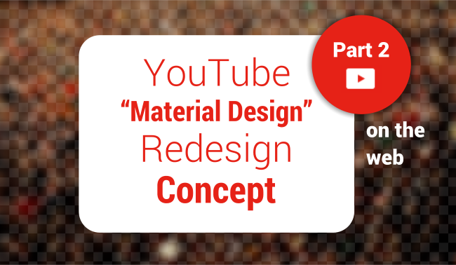
However, this is actually only the first half of this concept. Part two, featuring also an update in terms of functionality for YouTube, is already in the making. So if you're interested, check up back, soon!
What's your opinion on this redesign concept? Do you like Material Design? What do you think do videos represent in the context of the metaphor of this magical paper world?