|
Viewout
|
|

Nonetheless, the app is of course still far from perfect, with plenty else left to be improved. And while a previous concept of mine dealt mainly with the app’s visual appearance, this concept tries to focus on user experience and functionality, especially aiming at shifting more attention and importance on the platform's individual channels.
YouTube has lately done a lot for it’s content creators, including new dedicated apps, implementations of much requested features (and promises of more to follow), a more transparent communication, and not at least an extensive ad campaign. There’s no doubt here that this company really cares about it’s creators, or at least fears to lose them. Thus, I think it would apparently also suit YouTube’s current strategy very well to move more focus on channels.
Before starting, I’d like to point out that much of this concept was made before YouTube has released the previously mentioned big update last week, which is why some changes might seem a bit odd. Interestingly, the new channel-specific colored action bar corresponds well to the just explained aim to highlight channels more, and was actually already part of this concept before the update.
More focus on channels
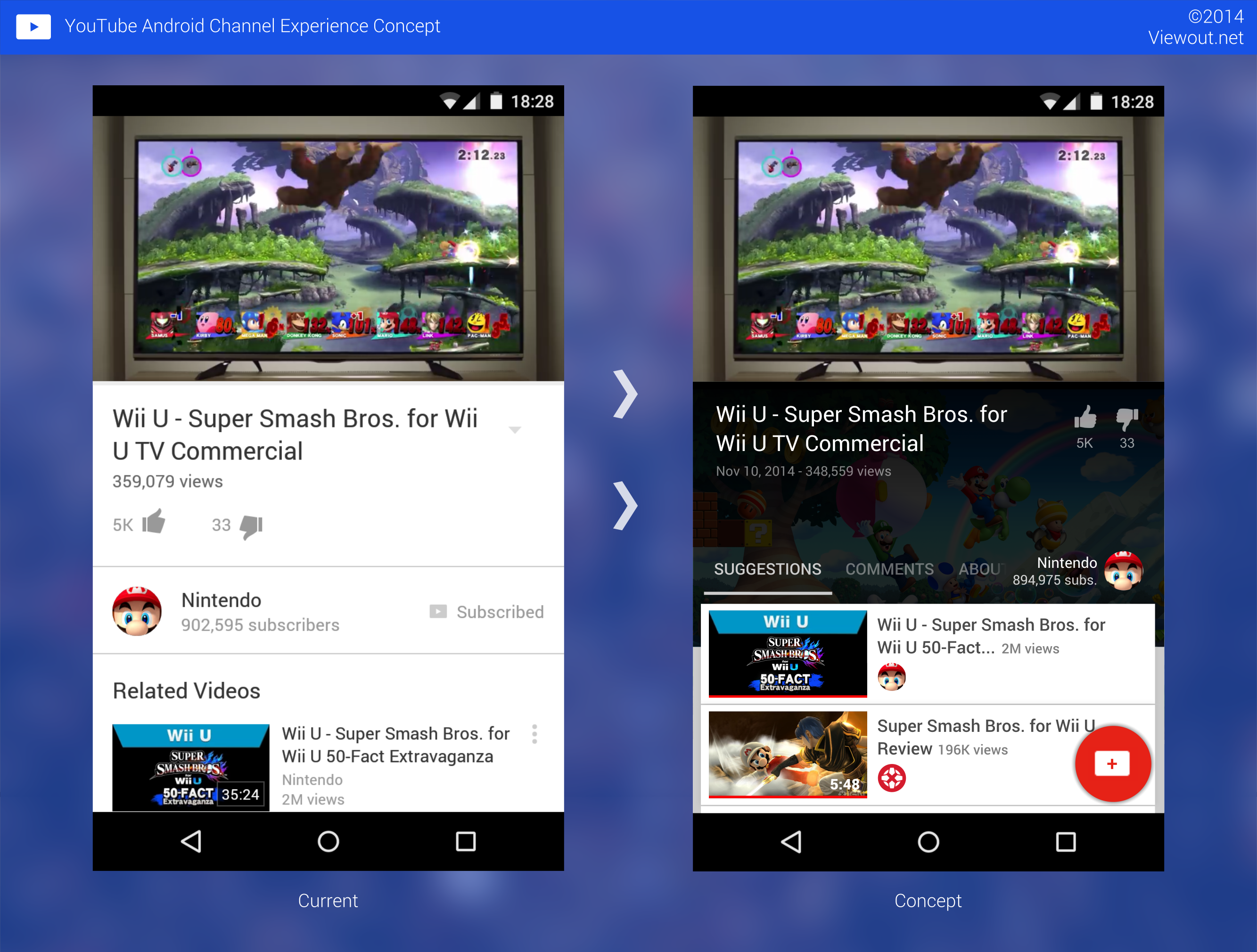
As already pointed out, this concept's main idea is to move more attention to the individual channels. Users should not be watching videos from, but within different channels.
For this purpose, a channel-specific hero image would be placed below the running video (this image could be slightly darkened and colored in the channel’s main color to differ it from the running video). This is actually heavily inspired by another past YouTube concept. Also all other elements (e.g. the channel info) would be arranged to empathize and strengthen this aspect of being within a channel.
Further more, a new tab-bar has been introduced in the concept to replace the current structure, where everything is simply listed one after another. This would not only give all sections a more prominent position, but there could also be easily more categories included without cluttering the interface, and it would also allow for more extensive implementations: the “sugggestions”-tab could for example show much more than just 3 videos, all directly within this interface.
Such an experience would not only further the individual channels’ brand recognition, but it could actually carry the meaning of YouTube as a platform to a whole new level.
Search
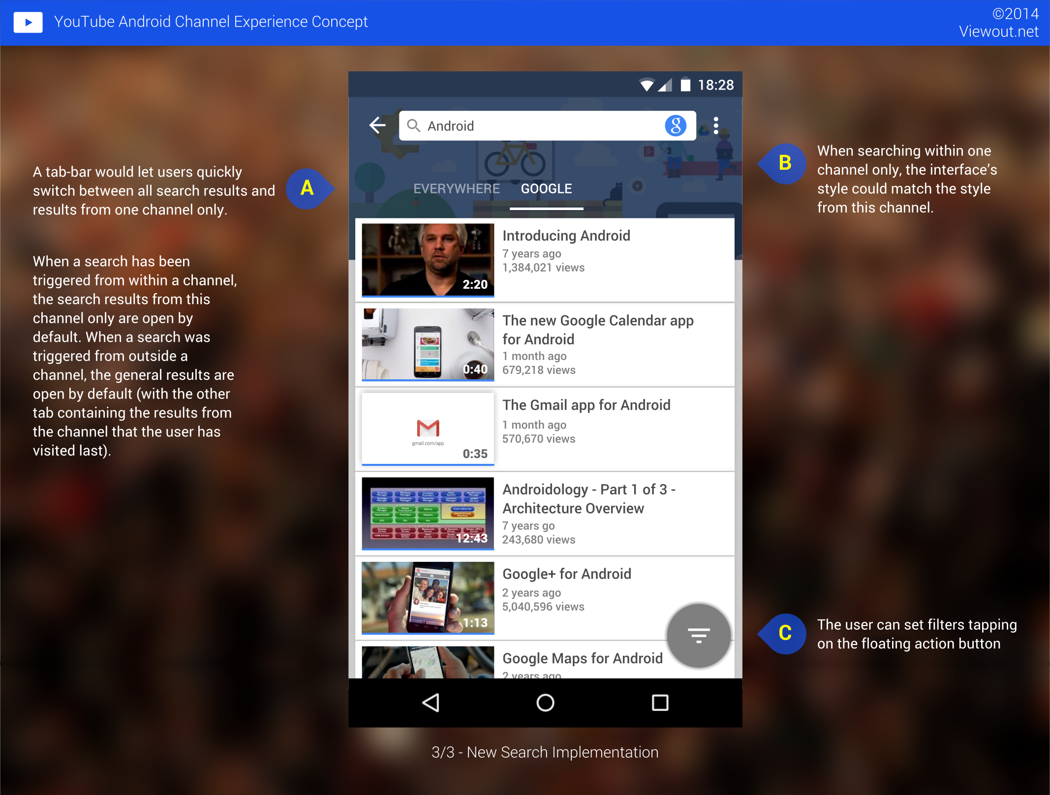
Even though belonging to the world’s most popular search engine, YouTube’s own search implementation is still hideous. Beyond trending videos, the service often struggles to understand what a user is looking for, and even worse in it’s mobile apps, many basic features are not even available, including the option to search within one specific channel only.
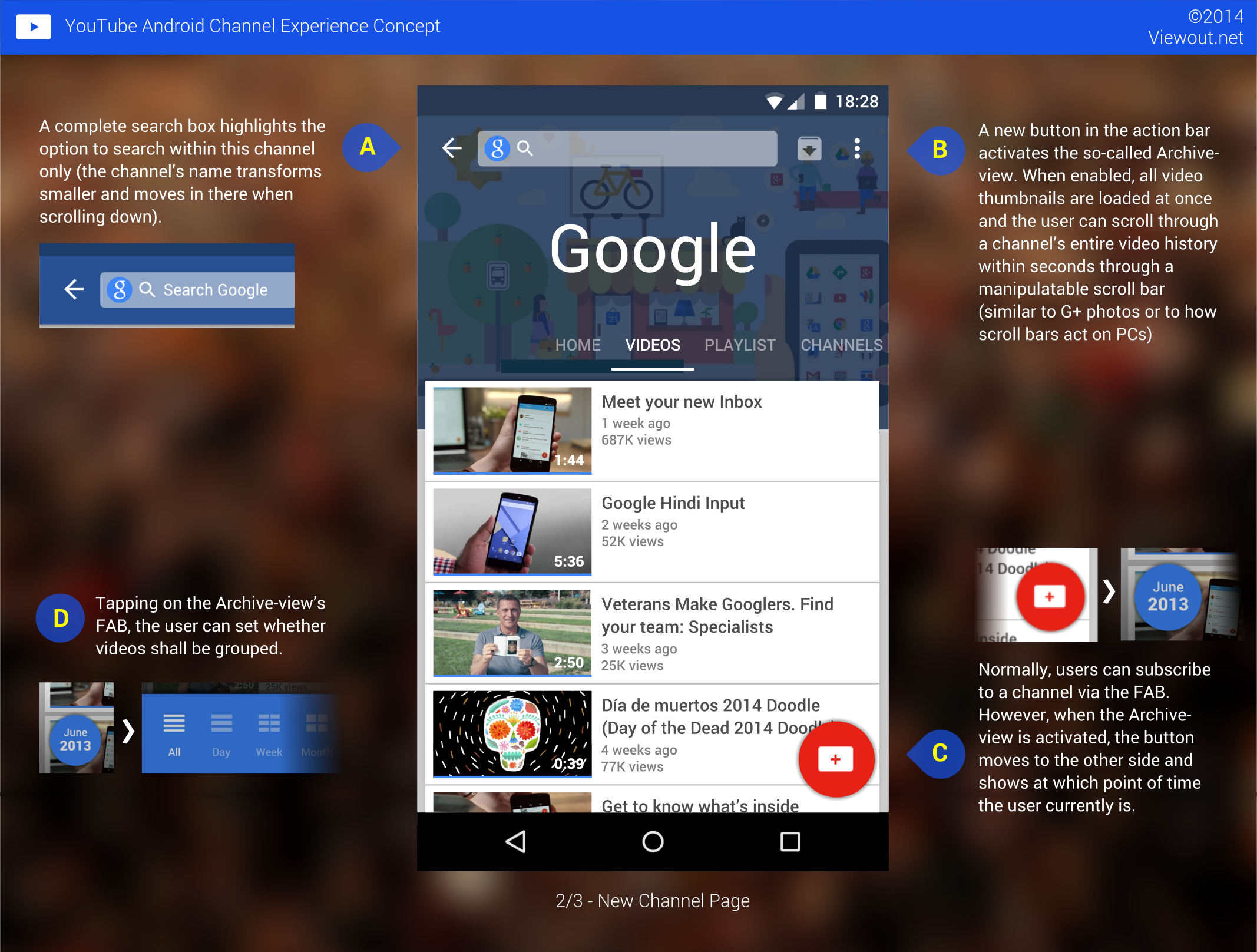
To improve search, the Android-typical search icon in the action bar would be replaced by a whole search box, which - when being on a channel page - would already be highlighting the option to search within this channel only. (In a very ‘Material’ way, the channel’s name would transform smaller when scrolling down and move into the search field).
In the results page, a new tab-bar would give the user an easy option to quickly switch between all search results and results from one specific channel only.
When having triggered a search from within a channel, the channel-specific tab would be open by default, and vice versa, when doing a search outside from any channel, the tab with all search results would be chosen by default (with the other tab containing the results from the channel that the user has visited last).
Also when searching within a channel, the interface’s style could be similar to the respective channel.
This seems to be a really great and easy to understand way to take use of tabs. Alternatively to offering different categories in search, other apps’ tabs could feature different filters or other ways to organize results, e.g. either by time or by relevance. And also beyond search, such easy tab implementations could prove very useful, being able to significantly simplify complicated processes and interfaces.
‘Archive View’
The description of YouTube's Android app's latest update claims that it's now "easier than ever to (..) rock out to old favorites". However, this is only referring to YouTube's new music subscription service, and if you want to enjoy and browse your favorite channel's older content, you're most likely still halted by an exceptionally low experience.
Playlists might help, but often it can already become problematic to find videos that are just a couple of weeks old in channel's that publish several new videos a day. And in such cases, the channel's playlists are most often just similar cluttered, confusing and unhelpful.
So to improve things, a special new "Archive"-view has been introduced in the concept. This view is activated via a new button in the action bar, which only appears in a channel's "Videos"-section.
Instead of a complete "Archive"-section, this view would make a couple of changes to the "Videos"-section: All videos' thumbnails would be loaded at once instead of the asynchronous loading technique normally found in this interface, and a manipulatable scroll bar could then allow a user to scroll through a channel's entire video history within seconds (comparable to the scroll bar from G+ photos or to how such bars work on PCs). The user would also be able to group videos by day, week or month tapping on a new floating action button in the bottom left corner.
In my opinion, the previously stated idea that users should not be watching videos from, but within different channels should be the way to go for YouTube in future. This concept heavily builds on this, and I think it leads to a lot of advantages. It's a system that users could easily follow, that would greatly widen the meaning of channels, and that would allow YouTube for complete new, innovative and extensive ways to interact with it's content.
You can follow Viewout on Facebook, Twitter and Google+!