
|
Viewout
|
|


Nevertheless, extra hardware keyboards seem to be not really the best solution. Of course especially the latest implementations are very well-made and easy to handle. But they seem to be rather designed for longer periods of use than for the average short interactions and work on the go, which is strange considering that portability is the biggest strength of a tablet.
One of the great aspects of your PC’s keyboard is that it’s just always there and directly accessible when needed, but at the same time also never in your way when you don’t need it. Especially virtual, but also hardware keyboards completely break down at this, having to be plugged in first when needed, and in the meantime always be carried around by you.
Instead of coming up with a better solution, manufacturers are apparently trying to temporarily transform your tablet into a laptop. Of course every software solution will still be far away from the typing experience offered by a hardware keyboard, but at least the gap between the two could be significantly smaller.

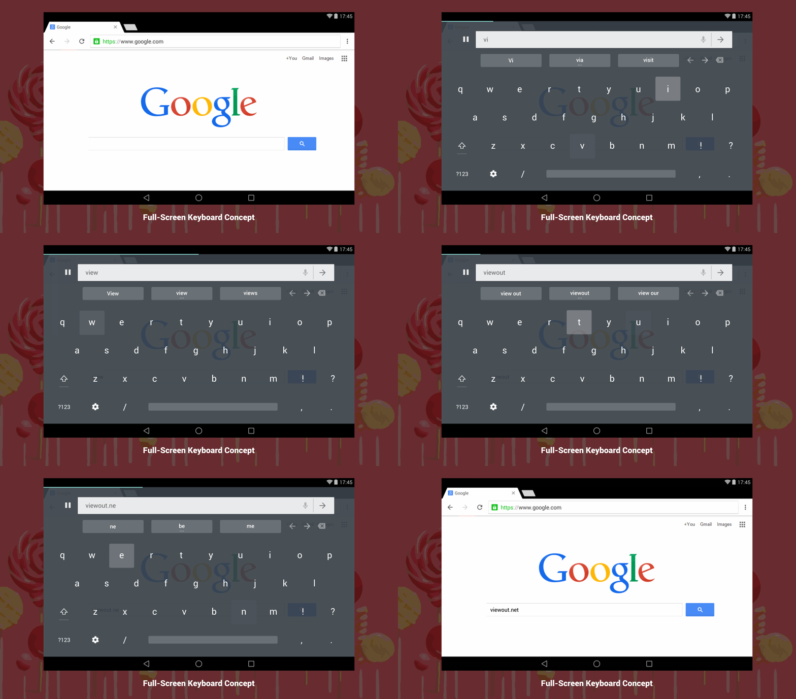
A virtual keyboard that runs in full-screen and automatically disappears
I think the keyboard presented within this concept is far superior to current solutions and comes at least pretty close to what hardware keyboards offer. The two main aspects are
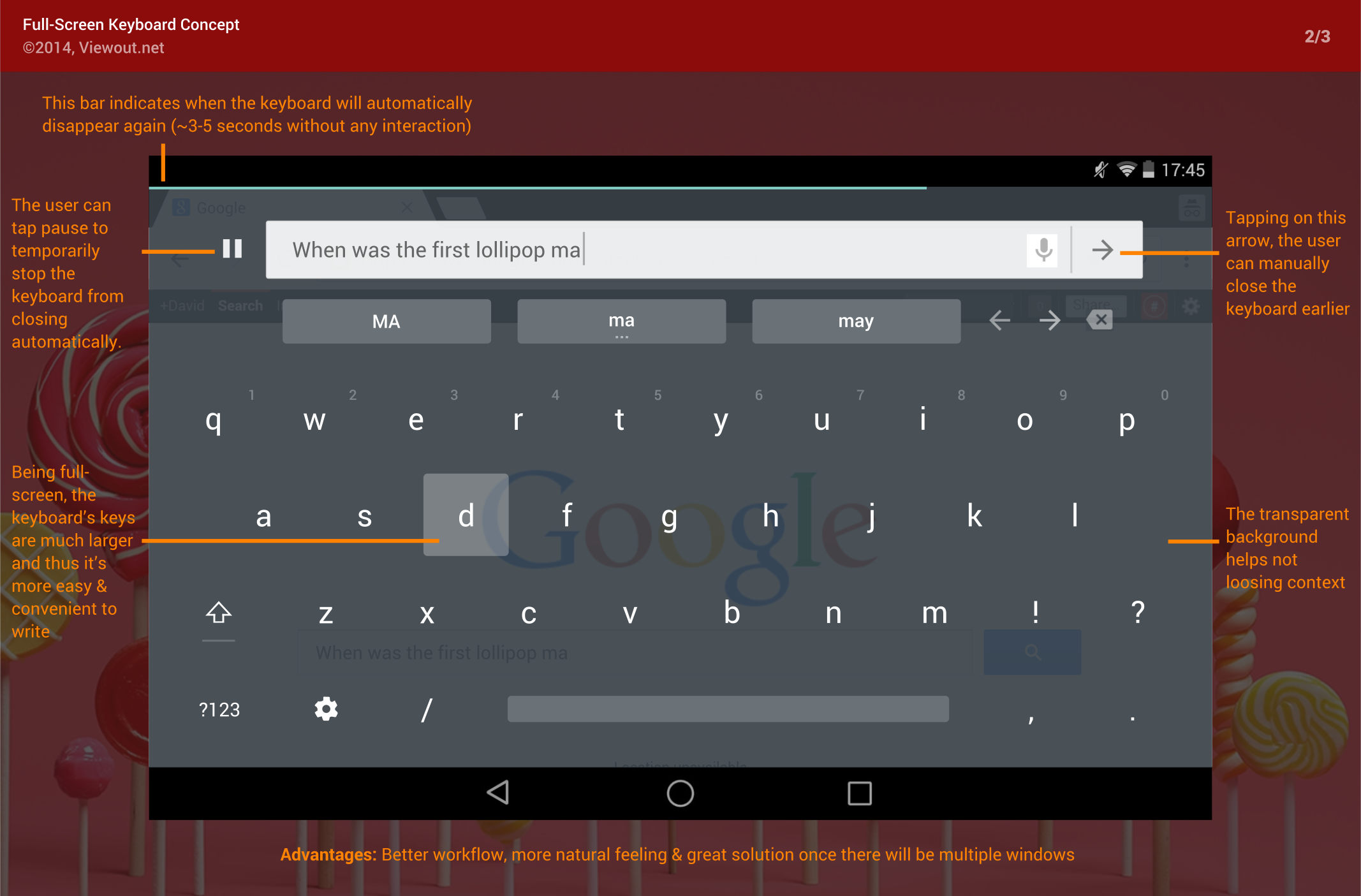
The user can also temporarily disable this, tapping on the pause button. This might for example be useful when not being sure how to formulate something or otherwise thinking about a sentence. Also, the user can tap on the arrow in the very right of the input field to manually close the keyboard earlier.
An easy way to describe the benefit of this is to imagine filling out a form on a touch device. Currently, you would have to repeatedly focus a field, write something, tap “finish” or touch somewhere else to close it, and then again focus the next field. With the concept keyboard, you could quickly tap on a field and type, and once you’re finished, the keyboard has already disappeared and you can directly and easily focus the next field, much more convenient, faster and more like on the PC.
Secondly, the concept keyboard runs in full-screen, giving space for much larger keys, which would - especially on tablet - lead to a significantly advanced writing experience. It’s intended for professional and fast use with multiple fingers (“touch typing”). Further more, the tablet might for example even be placed horizontally on a table like a hardware keyboard when typing.
Another key aspect is that the keyboard is transparent. While this might seem rather random or for aesthetic reasons at first, it helps the user not losing context when the keyboard is activated and displays a great advance.
Instead of trying to somehow connect with a focused textbox inside an app, the keyboard features it's very own input field. It helps focusing more on writing and leads to a more consistent and stable experience across different apps. The actual input field would simultaneously be updated in the background as well.

Current solutions often awkwardly jump when opening or closing the keyboard, trying to move the input field in center, which leads to a very uncomfortable and for many users also hard to follow experience. The transparency and built-in textbox both solve this problem by separating the keyboard more strictly from the content.
At the end, even though taking much more space, the full-screen keyboard is significantly better at staying in touch with the content.
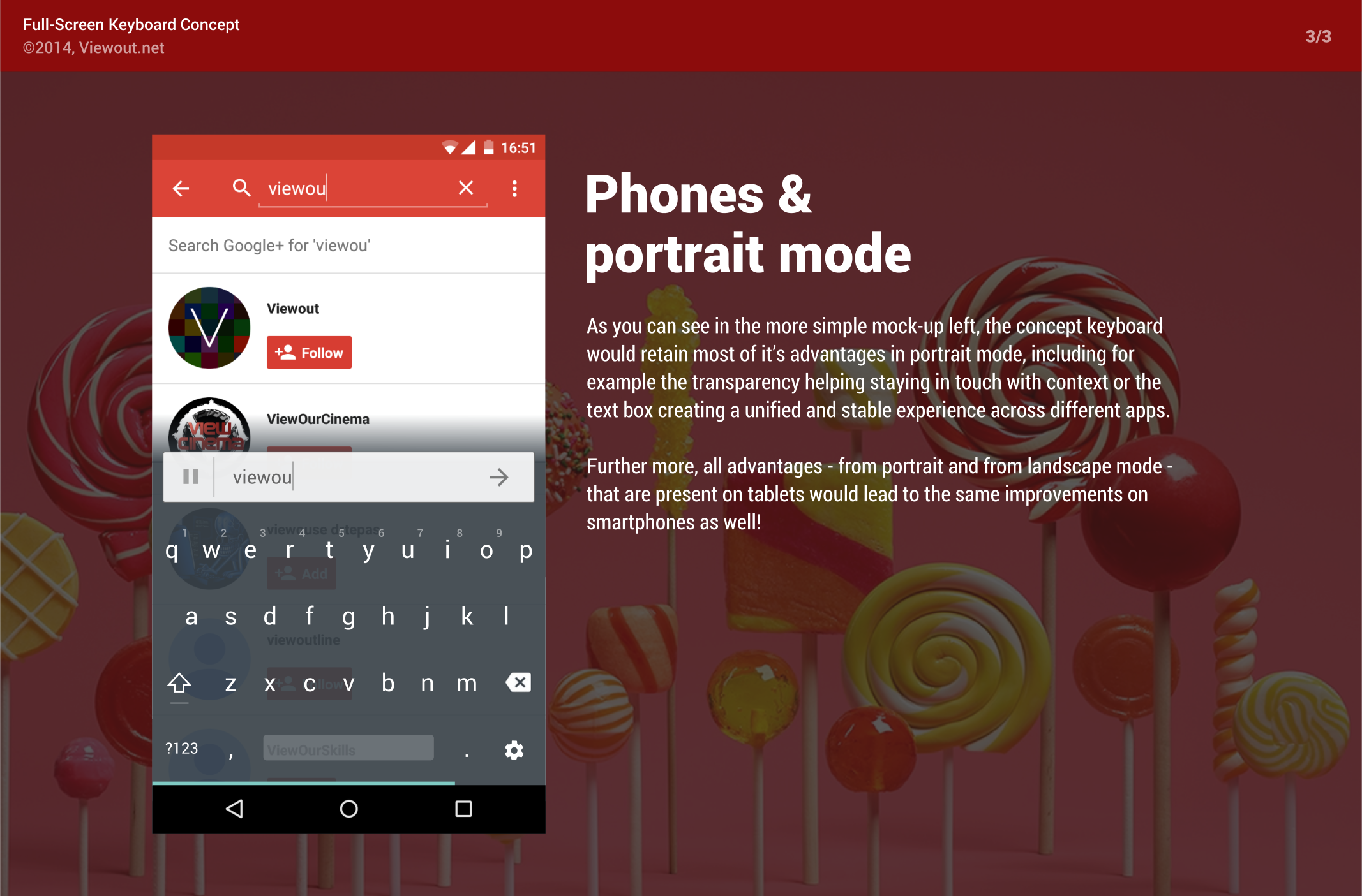
Phones and portrait mode
When not in landscape, the full-screen feature would of course not make any sense. However, due to many other features - e.g. auto-closing, transparency or the built-in textbox - the keyboard would still display a great improvement also for the use in portrait mode
Even though initially made for tablets, this concept would apparently also work well on phones with mostly the exact same advantages and possibilities.
Further thoughts: Ready for multiple windows
The fact that the keyboard strictly separates keyboard and content make it also ready for the use with multiple windows. This article was also initially actually started to solve the problem of how a keyboard could be implemented in this Windows 9 10 Concept published a few months ago, considering that you just can’t move a textbox in center when windows are placed over and below others, and that it does not make any sense trying to connect keyboards with an app when there are 5 or even more apps visible at the same time.
Summing everything up, I think this concept would havegreat potential, allowing for much more advanced typing and also beyond that heavily increasing the general user experience.
What do you think about this concept? Would you rather want a real hardware keyboard for your tablet or would you be satisfied with this implementation?
