|
Viewout
|
|

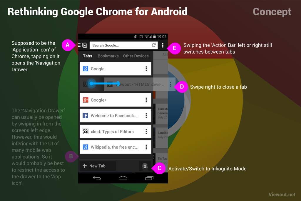
There's no doubt that Navigation Drawers are the new way to get around on Android. And it’s also a really great, intuitive and innovative way. So - why shouldn't Google Chrome get such a drawer too? It sounds totally insane at first, but it actually makes much more sense than you might think.
The idea is - as shown above - that your browser tabs are no longer listed in Chrome’s iconic 3D card interface, but in a new Navigation Drawer on the left. Everything else, as for example tab-switching by swiping left or right, would stay the same. The great advantage of such an implementation would be that more tabs could be shown at once.
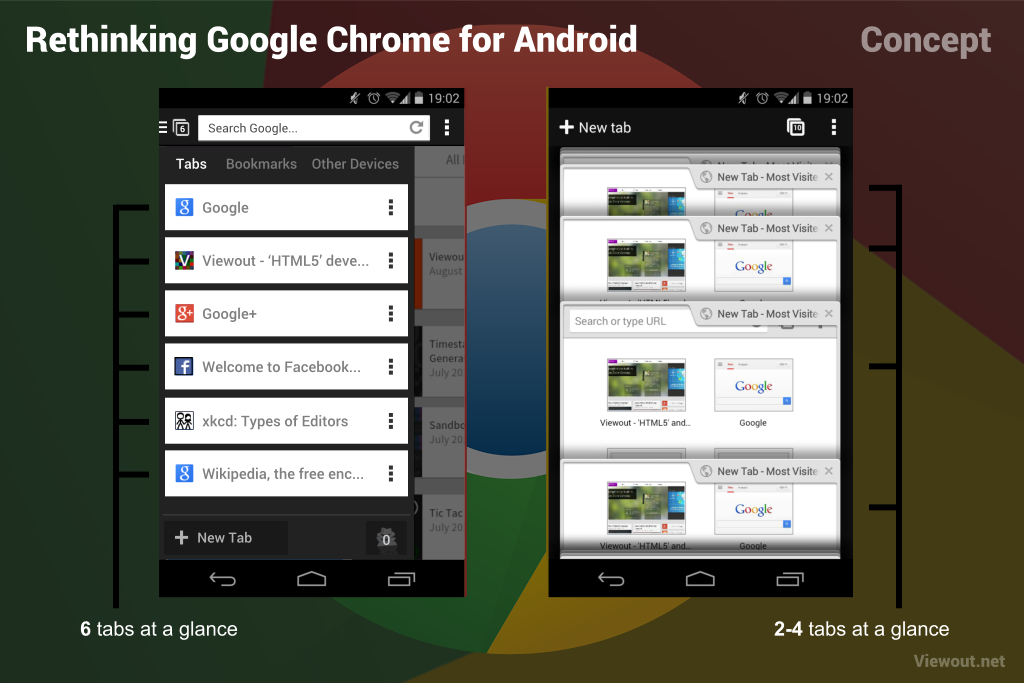
Currently users are only able to see about 3 tabs at once within Google Chrome. You may of course reduce the distance of the tabs using multiple fingers (one reason why the current feature is that much fun to use), but these are several interactions just to see what tabs you’ve opened. In a Navigation Drawer however there would certainly always be at least 6 tabs visible at first glance - if not even more.
Implementing such a Navigation Drawer would certainly shoot mobile browsing to a whole new level. Whereas mobile browsers are more kind like an “extension” today, allowing you to quickly open a site, this would make the whole experience much more like on the desktop - a completely different world.
Well, some people may think that the old implementation would be better. Some may also don’t want to surf on the phone exactly like on the PC. So Google should act very transparent and flexible here, giving the possibility to stay with the old navigation. After receiving the new Drawer with an update, the user should be asked to choose between the two implementations, though the advantages of the new one should be much more highlighted.
The big disadvantage with this however would be a break in continuity. Whereas the Navigation Drawer can normally also be reached by swiping in from the screens left edge, this wouldn’t be able here, as it would inferior with many mobile websites UI. For the same reason Google moved the tab-switching feature to the action bar only some time ago.
Even though this is in my opinion the only real disadvantage, I believe that this one problem might be big enough to mess the whole thing up. So due to this, Google maybe should not go for this one, but they definitely have to work on something similar and figure out how to make mobile browsing finally on par with browsing on the desktop.
What’s your opinion? Would you be happy with such a change? Or do you believe that the current implementation is already good enough?