Similar to Windows Phone, Microsoft’s strategy for tablets was once again to be
different. And in between today’s very restricted dominating mobile operating systems, “different” meant being much more powerful. Microsoft’s aim was nothing less than to create a tablet experience that could replace your laptop.
Click to hide images
Windows 8 was an extremely ambitious project and featured many creative and interesting new ideas. However, it’s obvious that Microsoft missed it’s aims, or at least missed what it advertised as their aims. A convertible device might be a good tablet and a good laptop in one device, but the tablet experience alone will never be even near your PC with the traditional desktop.
The next big update of Windows - which is allegedly codenamed “Threshold” - is said to change this.
Since the release of Windows 8, much has changed. Steven Sinofsky left the company, and Satya Nadella replaced Steve Ballmer as the new CEO of Microsoft. And since Windows 8 faced much criticism, the company seemed to step back from it’s vision and kind like ‘make the best of’ Windows 8. Actually, however, Microsoft has apparently learned that there can’t be one single interface for touch and for mouse interactions.
Windows 9 is allegedly going to aim for the same things like Windows 8. It’s said to merge the Metro experience and the traditional desktop by introducing Metro 2.0.
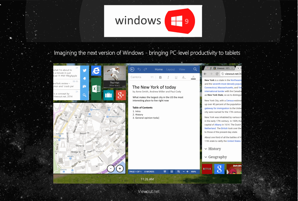
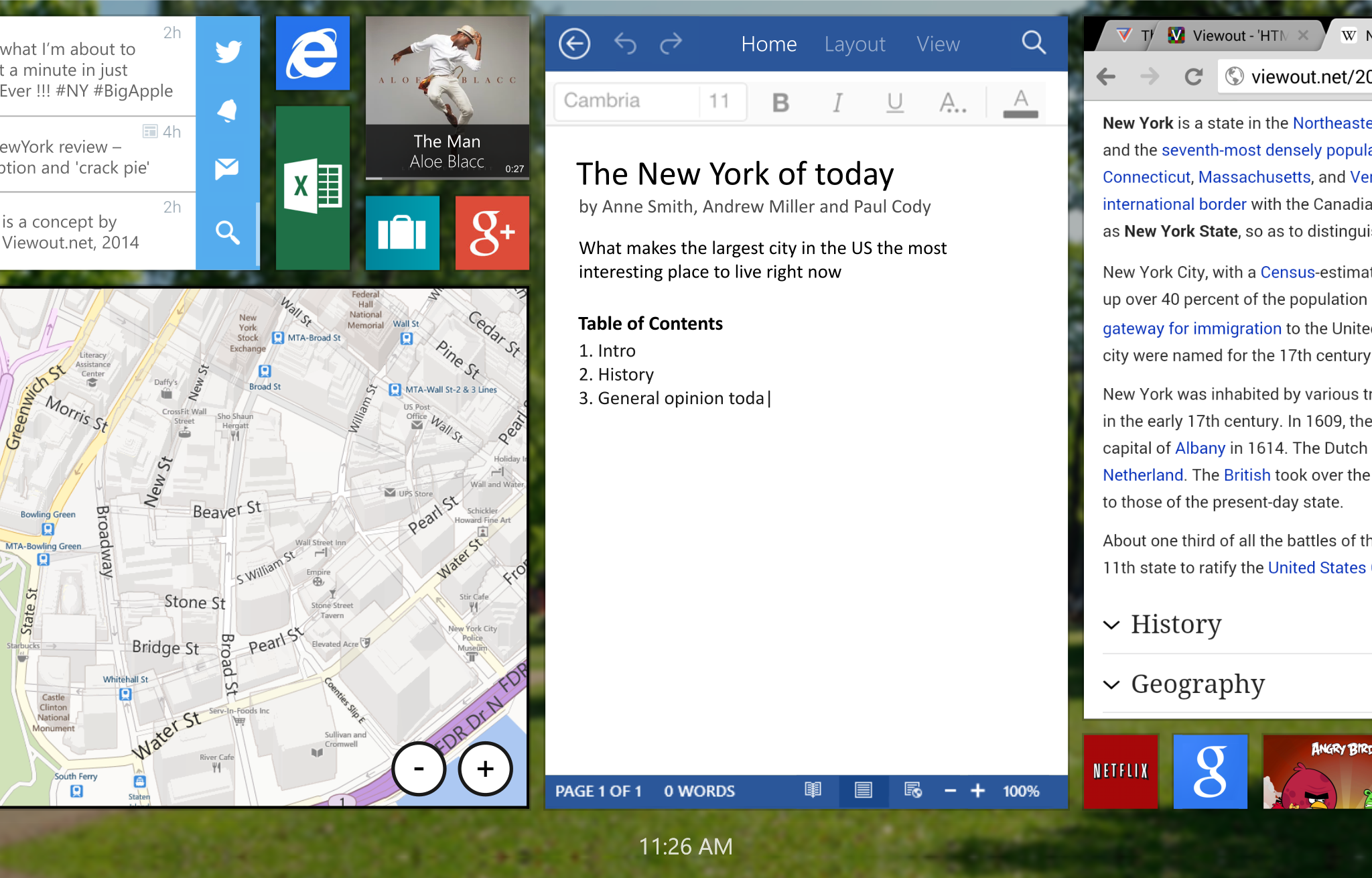
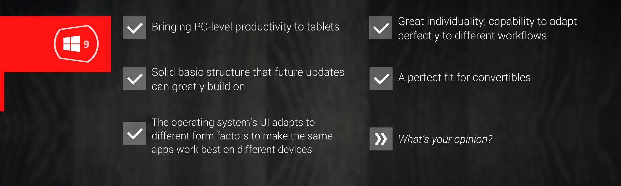
First previews of Windows 9 are set to be released in spring 2015, which is why we haven’t seen any more precise leaks or screenshots yet. Nevertheless, this concept imagines a completely new interface - much inspired by the traditional desktop - that tries to bring PC-level productivity finally to tablets.
I think the most important change would be to stop differentiating between desktop apps and Windows Store apps. They should both run in the same interface. Creating two completely separate experiences was always a silly idea.
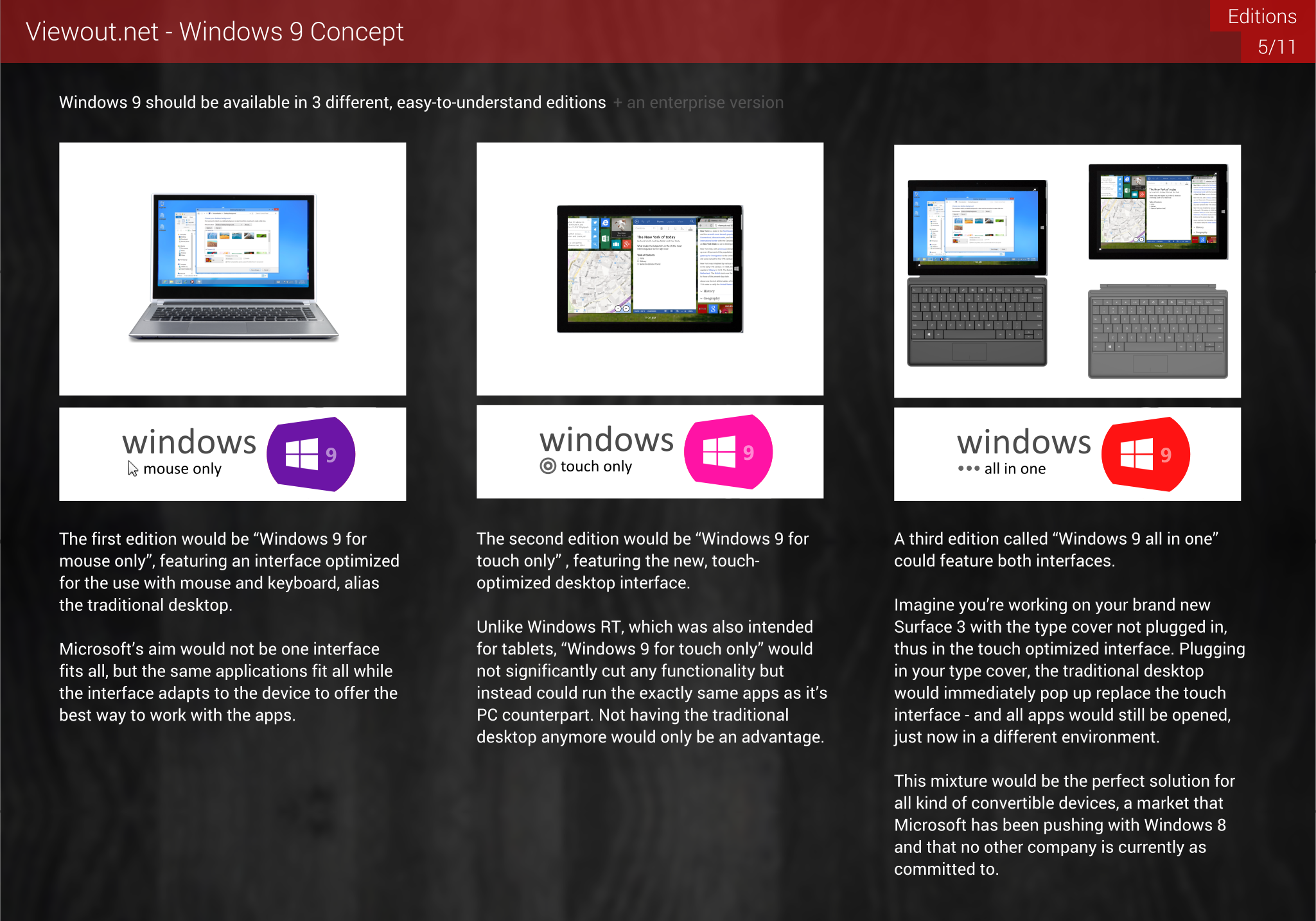
Also, I think the traditional desktop is here to stay. At this years Build conference, Microsoft already showed that Windows Store apps will soon also run on the desktop with an upcoming service pack update to Windows 8.1. And I think that for laptops and other devices with the mouse as the primary input method, the desktop is also still the best suited interface. The interface I want to present you here is not intended to replace the desktop!
Similar to how all apps and programs will run on the traditional desktop on the PC, there will also be a second, new interface where all programs will run on on touch devices.
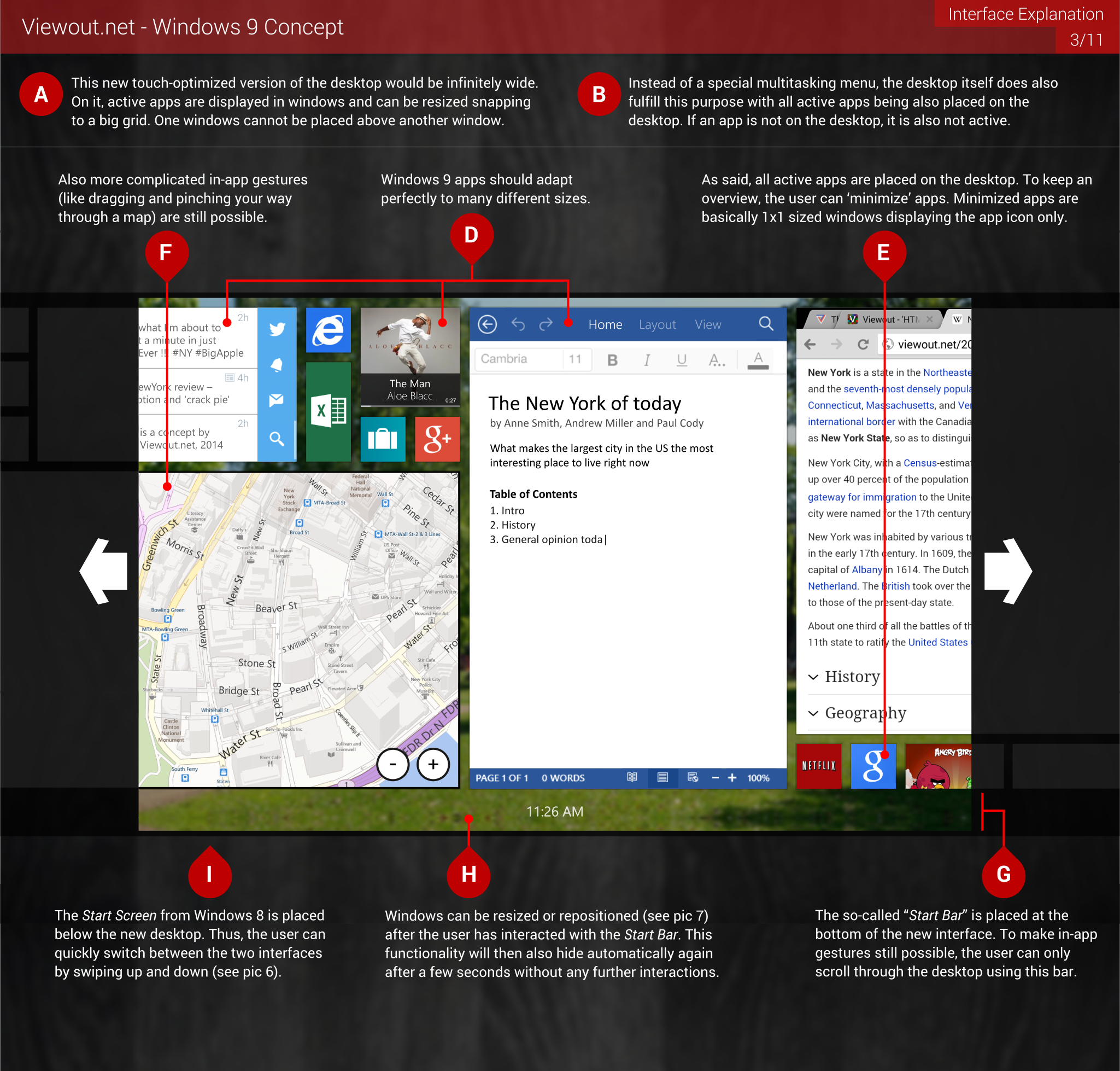
This new interface would also be called “desktop” - though sometimes referred to as “touch desktop” for reasons of differentiation. And it would also feature windows. However, it would work significantly easier than the traditional desktop: For instance, you cannot place one window above another. And you can also only size or position windows following a big grid.
A key difference to the traditional desktop, and a core feature of this interface, is that it’s
infinitely wide. The user can place dozens of windows side by side, and then scroll through them vertically. To make in-app interactions still possible, scrolling through the desktop is restricted to a new bar at the bottom - the so-called Start Bar.
The idea behind this huge amount of space is another important part of the new UI: all active apps would be placed on the desktop. There’s no way to minimize apps in the traditional sense and move them to kind like a taskbar or into a special multitasking interface. Instead, the desktop itself would fulfill the job of such a multitasking interface.
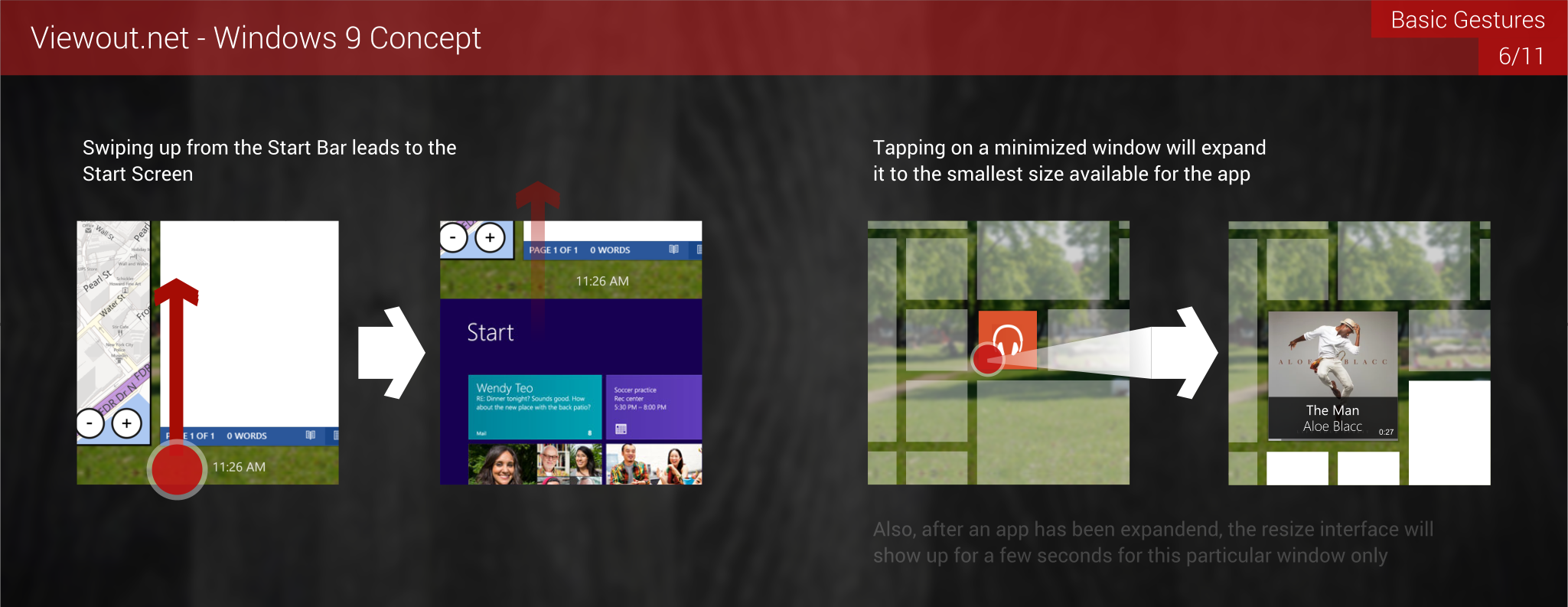
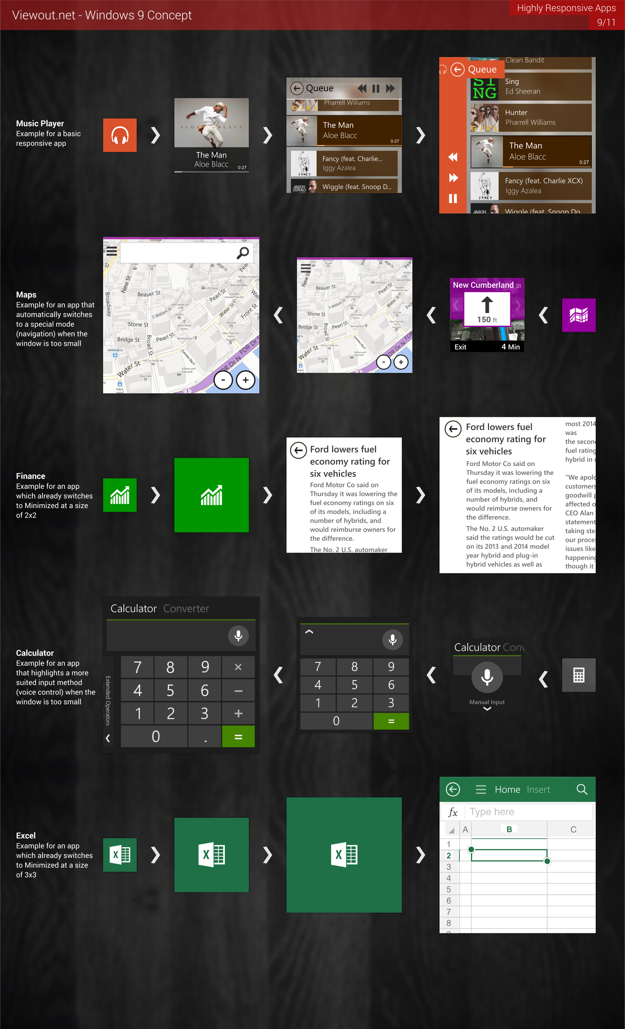
For this purpose, the user can “minimize” windows by sizing them 1x1. All windows of that size would do nothing but display the app icon. Unlike normal windows, minimized windows can also be moved outside of the resize-mode. Tapping on such a minimized app expands it to the smallest size the app has been optimized for. This implementation would help the user to still keep an overview of all active apps, which would otherwise become harder since all those active apps are at the same place now.
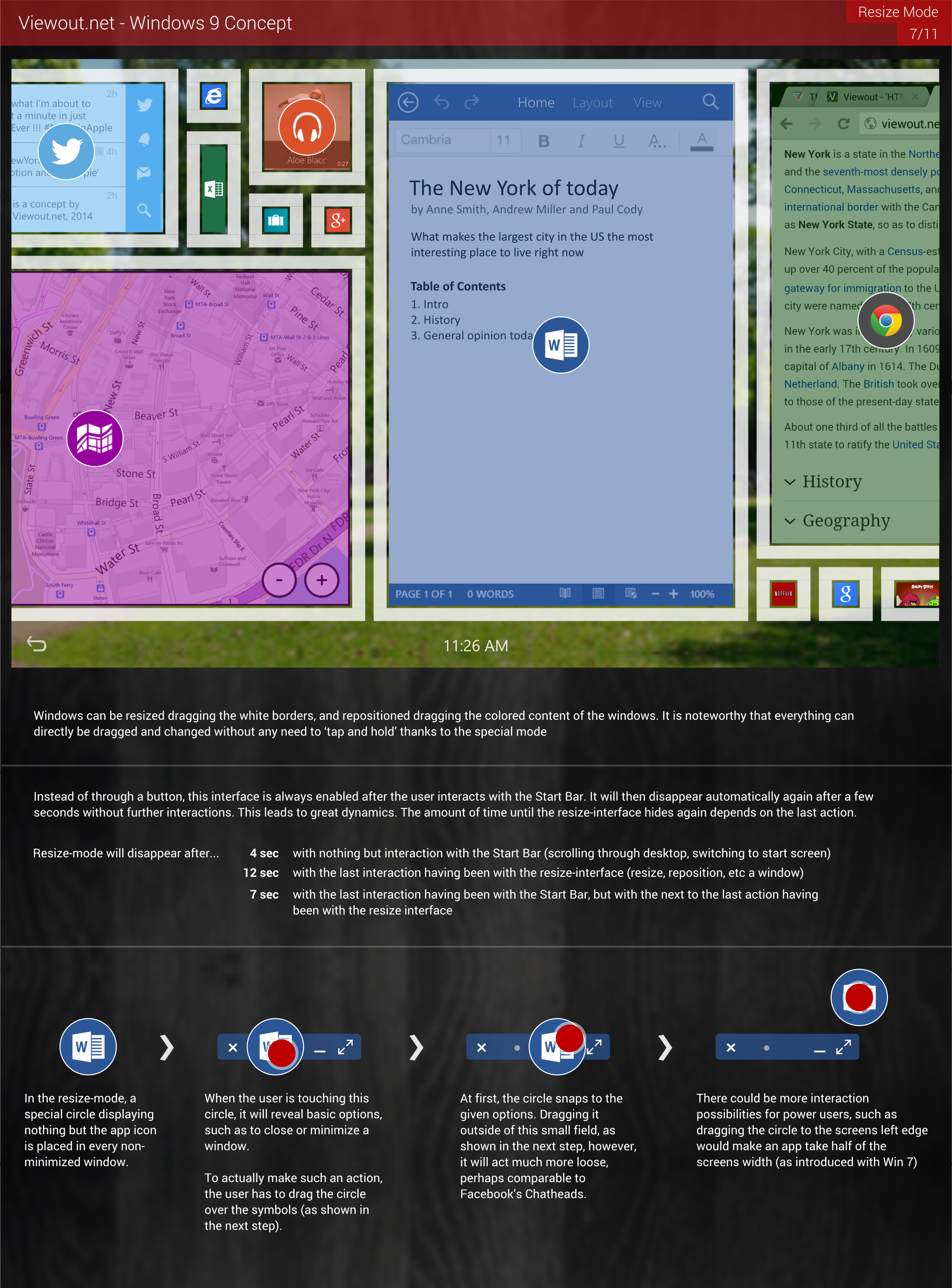
Another important aspect of the concept is the way that windows can be resized. Instead of enabling a special resize mode through a separate button, it would be implemented in a much more natural and intuitive way: The resize interface would always show up when the user has interacted with the Start Bar, and then hide automatically again after a few seconds. If the user interacts with the resize-interface, it would stay visible for a longer time period.
This implementation could easily lead to great dynamics. Whenever you have scrolled through the desktop, you can resize or reposition windows. Or the interface might quickly disappear again without disturbing your workflow and you can continue whatever you were doing. This non-obligatory option that pops up by the way is also very similar to how you can always resize windows on the traditional desktop.
Further more, the resize interface has yet a few more features, for instance a very distinct and nice design, and the great achievement to be completely “tap and hold”-free. All those aspects are explained more deeply within the fourth concept picture.
The last component of the new touch desktop that I want to present you here is the implementation of the Start Screen. While the re-introduction of Start Button and Start Menu might make sense for the desktop, the Start Screen does not only seem to be the best interface for touch-focused devices, but it also fits surprisingly perfect to the new interface.
The Start Screen would be placed below the touch desktop, thus swiping up from the Start Bar would lead to the Start Screen, as well as swiping down from the Start Screen would lead to the desktop vice versa (see picture 6). This would also make much sense for the user, who could easily understand where an app came from and how the whole system works. There are no hidden charms or other menus and options hidden behind every corner, no endless multitasking interfaces and no separate desktop: just these two interfaces!
I’m personally really confident about the power and the possibilities of this interface. It may still take a bit more time to understand for the average user than for example an iPad, but therefore it also rewards you with a far superior experience, and it’s also considerably easier to understand than Windows 8!
I’d also like to emphasize the great individualism and capability to adapt to many very different workflows. This aspect is also very reminiscent of the traditional desktop. I think the 4 example pics give a great overview at what’s possible.
At the end, I could even imagine tablets becoming more productive than the traditional desktop in certain cases thanks to this UI. Using your fingers is significantly more intuitive and faster than using a mouse, but up to now no UI seemed to make a real advantage out of this. As this whole system is also a great foundation for future updates, I can really see tablets becoming the new working machines soon!
What do you think about the interface? Are you already satisfied with Windows 8.1’s 4 side by side apps or maybe even with iOS’ and Android’s full-screen apps? Do you think tablets might offer greater productivity than PCs one day?