

|
Viewout
|
|



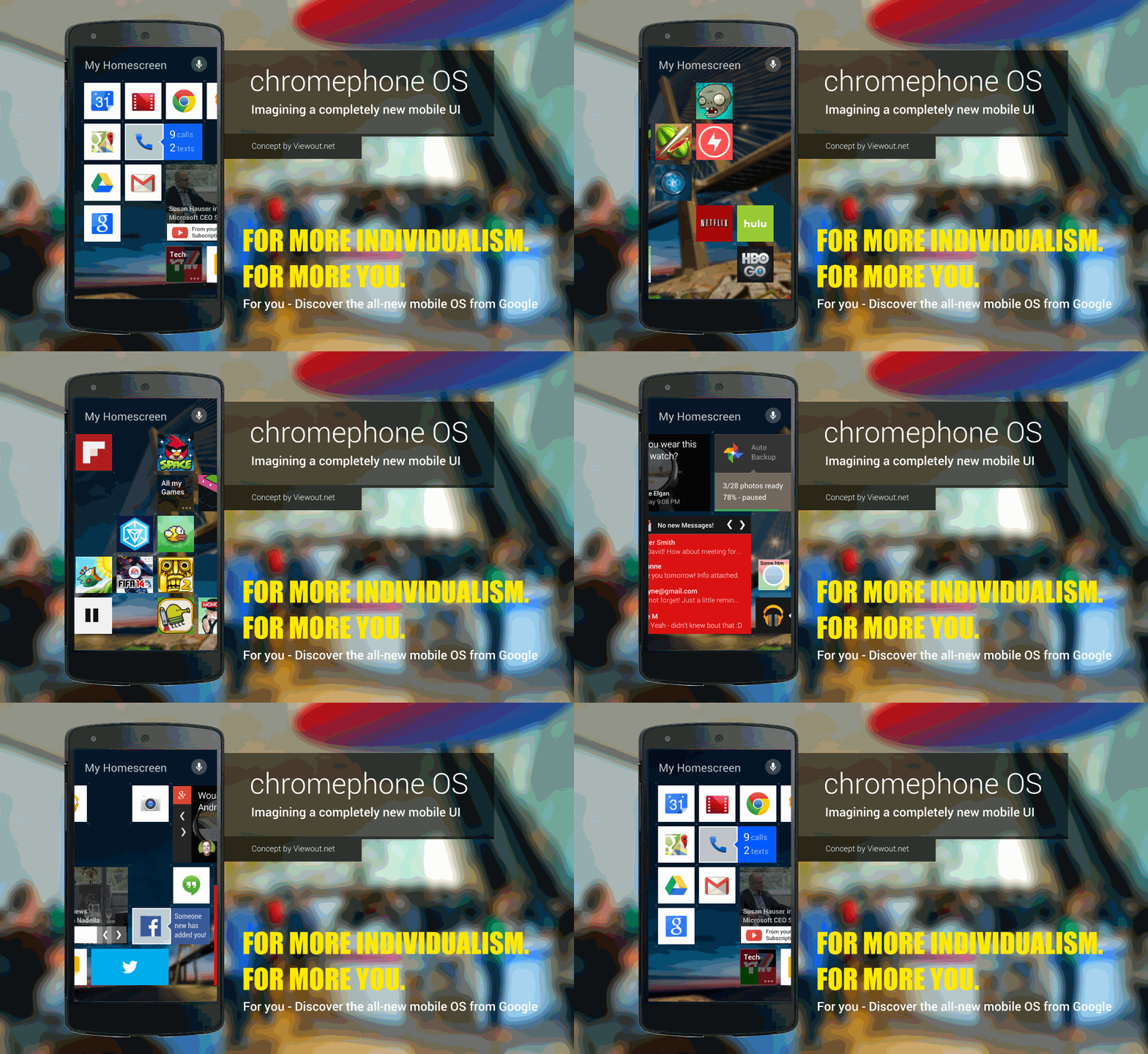
I want to clarify that this concept is not directly about Chrome or Google, but it's more kind like a symbol for a completely new UI. Showcasing many smaller ideas and concepts, you may as well call it 'iOS 9', 'Android 5.0' or 'Windows Phone 9' concept.
It has actually also lots in common with Microsoft’s current design and UI approaches. The advantage naming it Chromephone, however, is that it displays less an evolution of any established OS, but a whole new beginning, unrelated to anything existing.
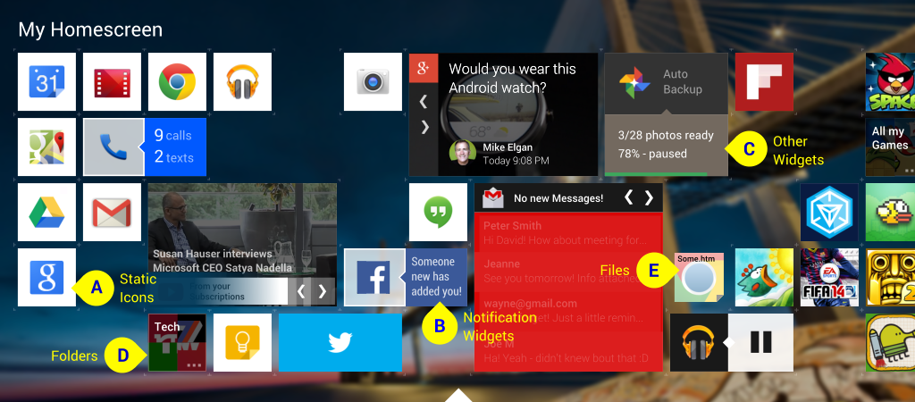
Other parallels to Windows 8 include that the homescreen is infinite and that the user scrolls horizontally through it. But unlike Windows 8, homescreen elements can be placed free, more like on Windows phone. All sorts of application sizes are allowed and it’s up to the developers which sizes and styles they ship with their application.
There are five different types of elements that you can place onto your homescreen. As already marked above, these types are “Static Icons”, “Notification Widgets”, “Widgets”, “Folders” and “Files”.
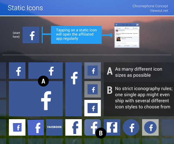
Appearance and look of Static Icons are completely up to the developers, though there might be some coarse design guidelines like for Android. Also the number of available sizes to include with an app should be free to the developer, though it would be best to include as many icon sizes as possible, thus giving users the full power to design their own homescreens.
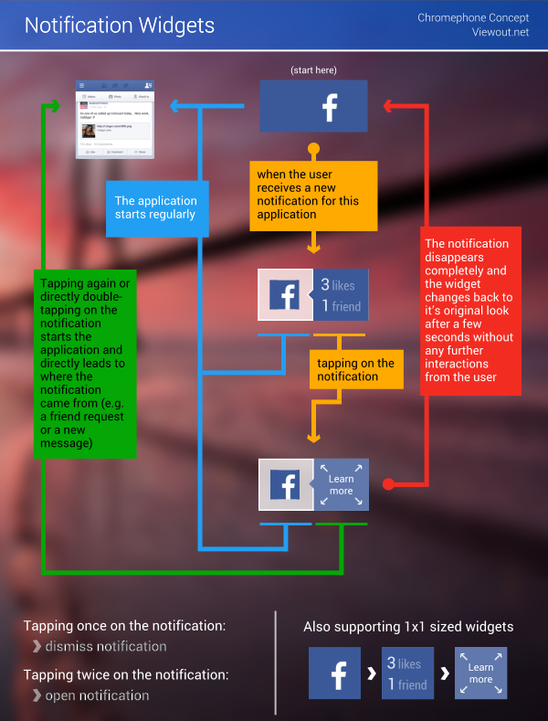
At first sight, Notification Widgets look much like Windows 8's live tiles. However, they're much more powerful.
In their normal state, without any pending notifications for an application, they look and act exactly like Static Icons. However, as soon as a notification arrives, it will show up next to the app logo, or if the widget is sized 1x1 it will show ahead of it.
The user has got two options to interact with a notification:
Interaction 1: Tapping once on it will hide the notification. Doing so, the widget will switch back to the normal state with the app logo.
Interaction 2: Tapping twice expands the notification. This means that not only the application will open, but that the user will also directly be guided to where the notification occurred/where it is relevant (for example directly to the right conversation within a messaging app or to an article within a newsreader app).
The great thing about these widgets are that they're very easy and clean, yet they give the user much power. It's not just tons of "Live Tiles" bouncing around with unhelpful info like on Windows 8, but the user has the possibility to hide anything uninteresting or to open relevant info. You should also understand that Notification Widgets should not display "You might be interested" stuff, but real notifications (like usually found in the notification bar on Android and iOS).
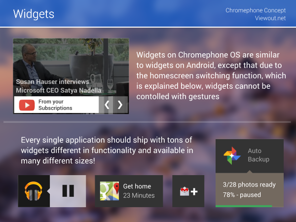
You may ask how all these widgets should be handled by the OS. For this I'd refer to an older concept of mine. The main idea was that the user first selects the application he wants a widgets from and first then he decides what widget he wants exactly. Changing the widgets size, the list of available widgets would update. This way, an app might have hundreds of variations, but always only about 6 visible at once. You can read more about this here. The design would of course have to be adapted to the Chromephone OS look.
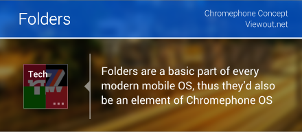
Due to this, the user could also sort his widgets into folders on Chromephone OS. As shown, their look is not much different and they can also simply be created as on other OSs by holding one icon over another.
Basically, the concept of multiple homescreens, which is explained below, solves the same problem as folders do. However, by enabling both, you once more give the user freedom over his homescreen and don't differ to much from other operating systems, which might be irritating.
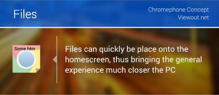
The idea is to bring the workflow much closer to the desktop experience with Chromephone OS. On the desktop, people naturally place files on their desktops. Files are lagered on the desktop while creating new files, placed there for visibility or for other reasons.
Basically, files on the Chromephone homescreen can be seen as temporary elements. You drag a file from the web there. And in the course of the next day when you have time or when you need them you can drag it into Google Drive or something like that. This would make the homescreen finally much more competitive to a real desktop!
For this, Microsoft has introduced an Apps screen, similar to the expanded Start Menu, where all of your programs are listed, which was part of Windows until Windows 7. This function, however, can be just as inconvenient, too.
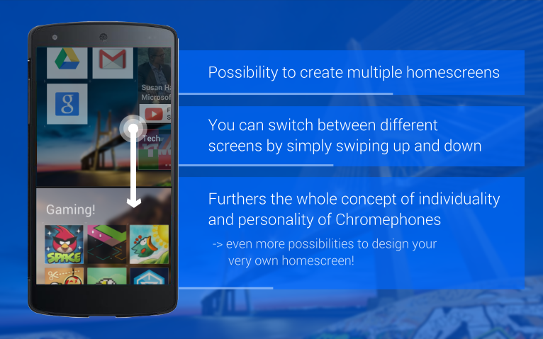
On Chromephone OS users have the ability to create multiple homescreens. Those screens are listed vertically, and you can switch between them by swiping up and down.
Once more, you should notice the individuality that would be achieved here. One user might prefer one, huge homescreen with all of his applications. One might like one with a few widgets for his most used apps and a second screen where he simply puts all of his downloaded apps. And yet another user might like to sort his apps into "Home", "Work" and "Travel" and manually switch between these categories.
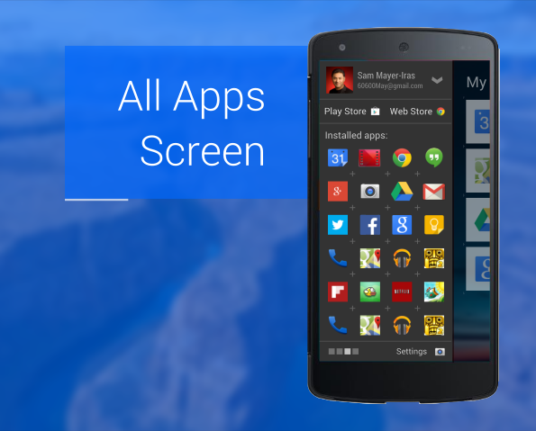
The All Apps Menu, which can be reached by pulling right, offers some basic settings and functions, including the option to quickly switch to another account. To heavily increase the workflow, tapping twice on an app icon would automatically add the app at the end of the homescreen, thus the user would not always have to drag every icon separately into the screen.
Also, the apps would be listed on many pages which the user can swipe through instead of one, infinite vertical list.
Tapping once on an icon would not - as you might expect - open the application, but first open a submenu, where the user can reach info about the app, delete it, place it on the homescreen and of course also open it. This would also support the idea that the menu shouldn't be used too much.
(By the way, I believe that if there might really be Chromephones one day, they would probably focus much more on speed, simplicity and a good price, similar to Chromebooks)
