
|
Viewout
|
|

Nevertheless, the user experience and management of widgets hasn't changed and is still very poor. As is also the quality of widgets. Some developers ship their applications with tons of widgets all being basically the same, but in different sizes. Some may make them resizable, but all in all also only include 1-2. And the majority still does not even include any widgets at all. Additionally also the design and feel of widgets is mostly more than outdated and their functionality is limited, too.
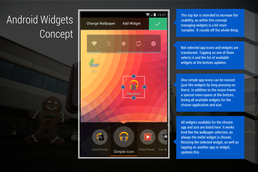
The concept shown here tries to find a way widgets can become an as powerful form factor for Android as they used to be. The general idea is that applications should ship with much much more widgets (being different in functionality, not only in size). And to prevent the list of widgets from looking cluttered, all these different widgets shouldn't be simply listed anymore, but shown in an app-specific interface.
You first select an application and the size of your widget, and first then all widgets available for these conditions are listed.
In the same way widgets are currently resized (long pressing them), every simple app icon can also be resized in this concept. And in addition to the resizing-frame, there’s a new menu at the bottom now, listing all widgets available for the chosen app-size. There should be a much greater variety of widgets, and with this concept, they would also finally fit into the overall user interface.
The concept picture above may help understand what I’m trying to describe. I personally think that this is the sort of thing necessary to revive widgets on Android.
It would create an extremely personal experience on Android, as users would be able to easily chose from a much bigger number of widget types. One may prefer many small widgets with different functions (maybe even several small of the same application), while another user wants to have a less cluttered, but maybe more up-to-date homescreen.
There should be a much greater variety of widgets, and within this concept, the UI would finally be ready to handle such a larger number of widgets rightly.
There are a whole lot of possibilities, even with the current few gestures. Think for example of a simple, small play/pause button for Google Play Music. Why don't we have something like this already now? Or a bookmark to your favorite song. Today we only got one 1x4 unresizable bar. I’m pretty sure developers would also find tons of useful ideas for their own applications.
What do you think? Might this concept actually help widgets on Android get new life? Or are you happy with the current feature? May Google should even look for an all-new interface, like Microsoft with their tiles?
