
|
Viewout
|
|


Many people were rather skeptical about software buttons at first, but the majority of doubts turned out unreasoned. And now, more than 2 years after the release of Android 4.0, also the big Android manufacturers finally start to discard hardware buttons.
Even Microsoft has apparently recognized these advantages, as Software Buttons just became part of Windows Phone 8.1.
And while Microsoft has just copied their feature, the Android team could make the next big step by replacing Software Buttons and instead introduce new, system-wide gestures.
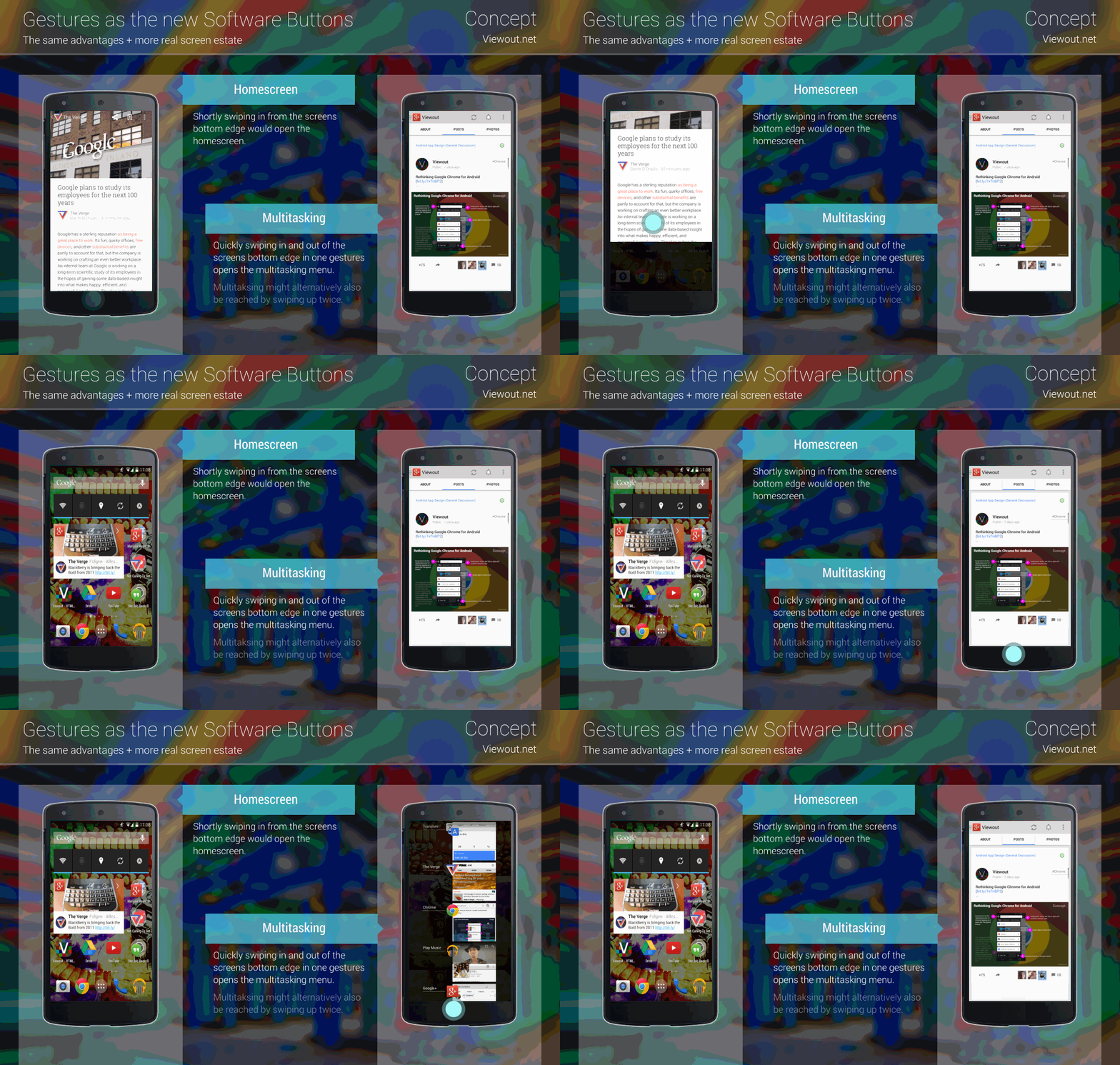
The concept pictures show what these gestures would work like. Swiping in from the screens bottom edge would open the homescreen. Swiping in and out of the screen in one gesture would open the multitasking interface.
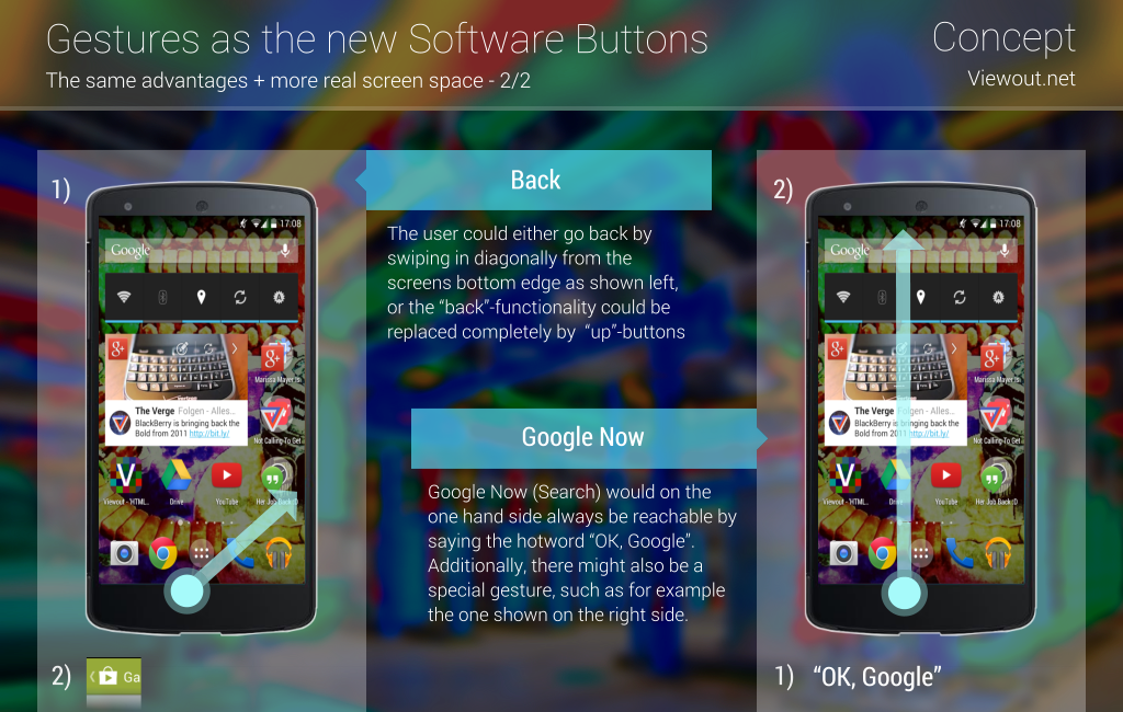
Further more, swiping diagonally from the screens bottom edge could go back (the “back” functionality might alternatively also be replaced completely by “up”-buttons). Google Now could either only be opened with a system-wide hotword - as I already imagined a few months ago - or additionally to this hotword also by swiping in from the screens bottom edge all way up to the screens top.

There are many advantages of such system-wide gestures. Most importantly, the user would gain more real screen space and there would be no difference in interaction within the new extensive mode and normal apps. Not to forget, gestures would also still have the same advantages as software buttons. Without the black box at the bottom, there might also be new possibilities for app design.
At the same time, there are also a few disadvantages and dangers. The user might for example not understand this. Due to this, there should definitely be a clear and easy tutorial, which would pop up several times on a new phone when the user does not make use of any interactions.
A bigger disadvantage might be that the consistency that Google once reached with software buttons could completely be lost with the introduction of gestures. Even if many people don’t know about Android, they might connect the fact that many phones have those black bottom bars. If these would be gone, distinguishing Android from other operating systems might be even more difficult. On the other hand side, with Microsoft just about to also introduce software buttons, this argument does not play any role anymore anyway.
You might think that such gestures would interferes with some established in-app interactions. However, there would be no new interactions that would be made impossible since there’s no difference to how the Google Now feature already interferes with the same gestures.
All in all, there’s basically no real disadvantage. Google would have to make it work very fluid, reliable and easy to understand. But I think with today’s computing power, all Google has to watch out for is a good tutorial.
What do you think about this? Would you be happy to have a bit more screen space? Or do you still prefer Hardware Buttons over everything else?
