All Posts

Concept on July 31, 2014 at 12:18
It’s very interesting to imagine any app being rethought with Material Design, but YouTube - which is part of Google - is especially interesting for a variety of reasons. This concept imagines what YouTube could look like on Android going all-in with Google's new design language.

Interestingly, YouTube was actually not even mentioned at this years I/O in the context of Material Design. And this although the very same service might actually could have been the origin of Material Design.

July 31, 2014 - 12:18
YouTube Web Material Design Redesign Concept [Part 2]
Bringing Material Design, multitasking, and a much TV-inspired atmosphere to YouTube’s website
Concept on July 8, 2014 at 13:52
It’s very interesting to imagine any app being rethought with Material Design, but YouTube - which is part of Google - is especially interesting for a variety of reasons. This concept imagines what YouTube could look like on Android going all-in with Google's new design language.

Interestingly, YouTube was actually not even mentioned at this years I/O in the context of Material Design. And this although the very same service might actually could have been the origin of Material Design.

July 8, 2014 - 13:52
YouTube Android Material Design Redesign Concept
Imagining what YouTube’s Android app might look like going all-in with Google’s new design language.
Concept on June 30, 2014 at 15:51
Microsoft’s aim for tablets was nothing less than to create a tablet experience that could replace your laptop.

However, it’s obvious that Microsoft missed it’s aims. A convertible device might be a good tablet and a good laptop in one device, but the tablet experience alone will never be even near your PC.

The next big update to Windows is said to change this. Even though first previews of Windows 9 won't even arrive before spring 2015, this concept imagines what might come next: A completely new interface - much inspired by the traditional desktop - that tries to bring PC-level productivity finally to tablets.

June 30, 2014 - 15:51
Windows 9 Concept
Imagining the next iteration of Windows. Imagining an interface that brings PC-level productivity to tablets.
Concept on April 25, 2014 at 16:34
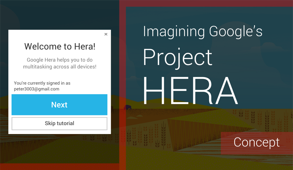
You might already have heard about Project Hera, a huge update Google is currently working on to "bridge Android, Chrome and Search". The project, which we first got to know through an extremely coarse and confusing Androidpolice article, seems to be definitely true, but only very few information is given at this time.

Hera’s main goal is apparently to create a cross-platform experience comparable to the tab-syncing feature of Google Chrome. It's also said that the user will be able to interact with an app without having to actually fully start it. Also, a great shift in user interface design seems to be on the way, aligning the experience across Android and Google’s web services even more.

I thought much about what such a cross-platform multitasking feature might look and work like, and I'm proud to present you this concept imagining Google Hera. It's extremely unlikely that Hera will even work only a bit similar to this, but it might paint a clearer picture of the great possibilities Hera might bring.

April 25, 2014 - 16:34
Imagining Google's Project Hera
What a cross-device experience might look and work like
Concept on April 18, 2014 at 19:06
This is my final entry for the Android UI/UX (Re)Design Challenge 2.0. It's a redesign of the normal Amazon app that is available from the Google Play Store (not their own store). Interestingly, even though Amazon is still the world's largest online retailer, the company has apparently only a very bad store for non-kindle mobile users.

Having such a bad app for your core business is very strange and also dangerous for various reasons. Interestingly, this app does not only ignore all of Android's design guidelines, but it does also not follow the style of Amazon's Kindle devices. It's rather a strange, outdated mobile version of Amazons website, which runs extremely insecure and slow.

My redesign does not aim at aligning the app to the Kindle Fire look, but at making it look like a normal Android app, following all guidelines. That's also the reason why this probably won't ever turn into reality. If Amazon will update it's app at all one day, then it will probably introduce the Fire style.

April 18, 2014 - 19:06
Redesigning Amazon's Android App
Concept: What might be if Amazon was a Google Company
Concept on April 15, 2014 at 18:31
Software Buttons were added to Android phones as part of Android 4.0 alias Ice Cream Sandwich. A lot of people were rather skeptical about on-screen buttons at first, however, most doubts turned out to be unreasoned.

Now, more than 2 years after the release of Ice Cream Sandwich, also the "big" Android manufacturers, such as HTC, finally start to discard hardware buttons. Also Microsoft added them to Windows Phone as part of the 8.1 update.

So while Microsoft has just copied their feature, the Android team could make the next big step by replacing Software Buttons with new, system-wide gestures.

April 15, 2014 - 18:31
Gestures as the new Software Buttons
Concept: The same advantages + more real screen space
Older
Newer
Website made in Europe.
Legal Disclosure Privacy Policy