Besides a refreshed top-bar, a new navigation menu, and overall slightly refreshed colors, the user can now always pull up the agenda for the days he’s looking at
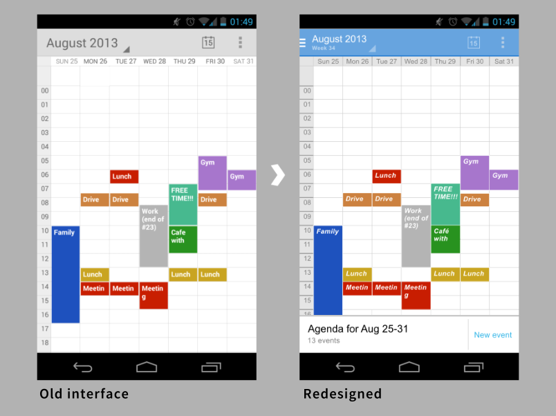
Besides a refreshed top-bar, a new navigation menu, and overall slightly refreshed colors, the user can now always pull up the agenda for the days he’s looking at
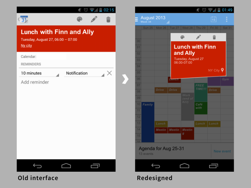
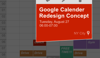
Instead of always opening an event in full-screen for just a handfull of information, a small card appears now when tapping on an event
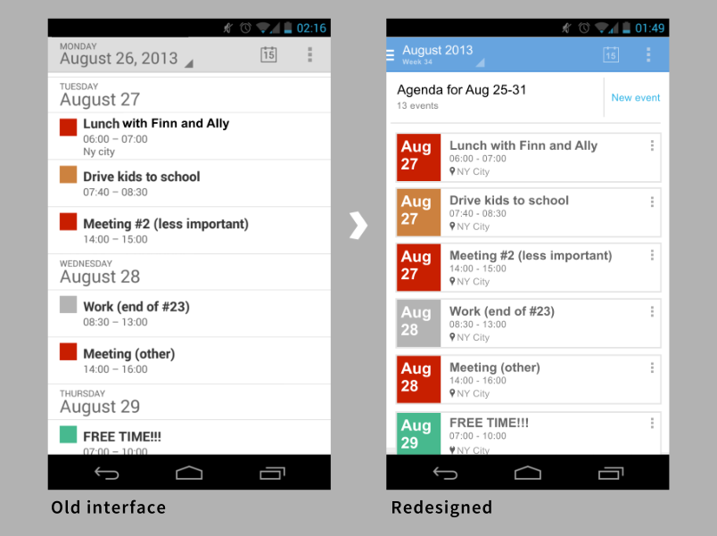
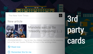
After pulling up the agenda, the events are listed as cards in a Google Now-like interface, bringing one of Googles best new design schemes also to calendar!
Throughout the last few years Google has somehow reached to make kind like all of it’s applications look great and fun to use. One of the apps that has not been full-redesigned for some time now is the Google calendar. It’s also a great application and much better than most not-Google apps, but it’s not comparable to what we've seen lately. So I kind of looked at other recently updated Google apps, such as the Play store, Google Maps and Music, and designed some changes and ideas on my own!
At first, the top bar got colored and a navigation menu has been added. There’s also now always the current agenda at the bottom, which can be pulled up, listing events that are set during the time space your looking at (for example month or another week).
Tapping on an event shouldn't always directly open a whole new page, as it is much better suited for these few information to be just shown in a small box. To change some deeper stuff, the user still can tap this box again of course.
At last also the agenda interface has been changed. Besides now being pulled up, the events are now listed in Google Now-like cards, as this seems to be the new overall Google design standard, and thus the calendar app finally really looks much better and modern and is also more easy and more fun to use!
What’s your opinion on this redesign concept? Do you think it would do well in between Google's latest updates? What’s your opinion on the new style seen lately in Google's app updates?