All Posts

Concept on March 17, 2014 at 21:42
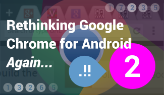
In a recent article I discussed the need of a new way to manage your tabs on Google Chrome on Android and on mobile phones in general. The basic idea was to replace the iconic card-interface with a Navigation Drawer, though at the end I concluded that Google definitely has to figure out how to bring mobile browsing finally to a whole new level, but that this particular implementation wouldn’t be the right way to achieve this.

So again I’ve taken some time and worked on another, slightly different idea. As shown above, this time I’m aiming even more for a desktop-inspired interface, placing real tabs on the very top. Google has already something very similar for Chrome on tablets, but this concept goes a bit further, adding new gestures to manage tabs better also on touch devices. The same ideas might easily be added to the tablet version, too.

As you can see, the tabs look pretty similar to pinned tabs on the desktop. Swiping a tab down closes it, which I think is a very quick way and can be infinitely useful. If the user has more than about 5 or 6 tabs open, he can of course scroll horizontally through the list of tabs - just like on the tablet version too. Tapping twice on a tab gives the possibility to reposition it.

March 17, 2014 - 21:42
Rethinking Google Chrome for Android Part 2
Another Idea to Bring Mobile Browsing finally On Par With Browsing on the Desktop
Concept on March 15, 2014 at 16:25
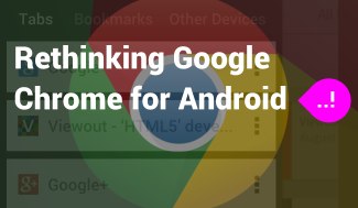
Google has added so-called Navigation Drawers to all of it’s mobile applications throughout the last year. And they are not finished with them yet: the first apps do already start to receive new updates going even further by placing also “Help” and “Settings” into the drawer, thus replacing the Action Overflow Button completely.

There's no doubt that Navigation Drawers are the new way to get around on Android. And it’s also a really great, intuitive and innovative way. So - why shouldn't Google Chrome get such a drawer too? It sounds totally insane at first, but it actually makes much more sense than you might think.

The idea is - as shown above - that your browser tabs are no longer listed in Chrome’s iconic 3D card interface, but in a new Navigation Drawer on the left. Everything else, as for example tab-switching by swiping left or right, would stay the same. The great advantage of such an implementation would be that more tabs could be shown at once.

March 15, 2014 - 16:25
Rethinking Google Chrome for Android
Should Google drop an unique User Experience in favor of more Productivity?
Concept on March 7, 2014 at 20:38
Nintendo should take over the music player business from Apple and build the next iPod. The sales of the iPod may be already declining, but I think Nintendo has the creative power and abilities to build a music player still worth buying today in midst of the 10s where every phone can do the same.

Nintendo is already strongly involved in some highly competitive markets, but I believe they might succeed against Apple following two easy steps:

STEP 1: I’ve already pointed out that I don’t think Apple is going to end the iPod business immediately, but that they probably will still release one to two hardware updates before the final end. However with Nintendo entering the market, Apple would probably react very offensive and release more and faster hardware updates than currently planned.

Because Apple’s devices would probably easily kill Nintendo’s, Nintendo should try to calm Apple down, emphasizing that they don’t want to steal their iTunes income. Of course a music player by Nintendo would have to feature an in-house music store, but this store should not be put in focus too much, but instead the possibility to get music elsewhere (for example from iTunes) should be highlighted strongly. Thus, Apple might care less about losing the iPod business, whereas the iTunes sales wouldn’t be affected.

March 7, 2014 - 20:38
Nintendo should build the new iPod
Painting the idea of a device reviving Music Players as well as the interest in Nintendo
Concept on January 26, 2014 at 13:02
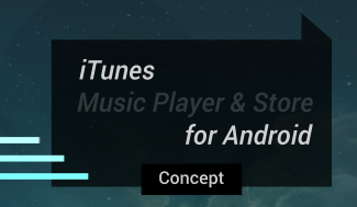
With the release of Google Maps for iOS, Google decided more than one year ago to take iOS really seriously and to create really gorgeous apps for the system. The latest applications to join this list of great Google apps on iOS were Google Play Music and Google Play Movies & TV. The main reason for the adaption was probably Google’s new music streaming service Google Play Music All-Access. Nevertheless, I personally began purchasing songs from Google Play now, because all my songs are now synced across my Windows PCs, my Android Smartphones and Tablets, as well as on my old iPod Touch. And because of this I noted at the end of my article about a possible web adaption of Google Play Newsstand that “being extremely limited and short-sighted, Apple cannot even offer me half of what Google already does”. But why not?

Why shouldn't Apple release a version of iTunes for Android?

I really thought very much about this idea and came to the of course already expected conclusion that such an adaption would make absolutely no sense for Apple, which I'm also going to point out in just a minute. But I really like the idea of iTunes for Android and so I created some mockups (4) imagining what such an app might look and feel like.

January 26, 2014 - 13:02
iTunes for Android Concept
Imagining what might be next if Apple wasn't Apple
Concept on December 1, 2013 at 17:00
The new and just released Google Play Newsstand application combines former Google Currents and Google Play Magazines, offering the user both, paid subscriptions to newspapers and magazines, as well as free web articles, RSS feeds and blog posts. It’s currently an Android exclusive, but the company already confirmed the work on an iOS version, which is scheduled to be released next year.

But what about a web version? The ‘magazines’-section with all the subscriptions is of course already built into the Play Store. But why not replace this section with a new Newsstand section, too, thus also adding the (free) web stuff? What such an implementation might look like is shown in the concept pictures above (in full-size and uncropped: Concept1 and Concept2).

There are a lot of things that point against such an implementation.

Google is, for instance, already in charge of a news service on the web - Google News. Why shall they work on two very similar, competing services? Google News’ design might not be as up-to-date and beautiful as the new Newsstand app, but with an update it might easily become that nice looking, too. And maintaining two services seems even less likely when thinking of the ‘death’ of the Google Reader and Google’s intent to keep their product lineup as clean as possible. - Or might Google News be the next service Google wants to get rid of?

December 1, 2013 - 17:00
Play Newsstand Web Version Concept
What about a web version of the new Google Play Newsstand?
Concept on November 8, 2013 at 14:51
Within Android 4.4 KitKat, widgets may have lost their very prominent positioning directly next to the app list, but while adding them to the same place like wallpapers sounded strange at first, Google - in contrast to many manufacturers - found a really great solution with this 'homescreen-editor'. It’s not just a new option there, but the overall interface just makes more sense.

Nevertheless the user experience and management of widgets hasn't changed much and is still very poor. As is also the quality of widgets. Some applications include tons of widgets all being basically the same, but in different sizes. Some may make them resizable, but all in all also only include 1-2. And the majority still does not even include any widgets at all. Additionally also the look of widgets is mostly more than outdated and their functionality is limited, too.

The concept shown here tries to find a way widgets can become an as powerful form factor for Android, as they once were. The general idea is that applications should include much much more widgets (being different in functionality, not only in size). And to prevent the list of widgets from looking cluttered, all these different widgets should not be simply listed anymore, but shown in an app-specific interface.

November 8, 2013 - 14:51
Android Widgets Concept
Reviving Widgets on Android
Older
Newer
Website made in Europe.
Legal Disclosure Privacy Policy